This is Part 2 of the discussion I started in March with this article. It frames this discussion.
I ended Part 1 of this discussion with a statement from Michael Dennis of the U.S. National Geodetic Survey. He said while people understand that the 14-parameter transformation algorithm is important in transformations between horizontal datums, the step people are leaving out is reconciling epoch dates of the data.
What is an epoch date?
The epoch date is simply the date in which geospatial data is referenced. It can be the date the data was collected or a standardized date. For example, the current NAD83 (North American Datum of 1983) datum has a standardized epoch date of 2010.0 (January 1, 2010).
Why do we care about the epoch date of geospatial data?
It can be overwhelming to think about trying to populate and manage a centimeter-level GIS, and even more unfathomable when one considers the fact is that the land we occupy is moving. Some refer to it as continental drift. Scientists refer to it as tectonic plate movement. Geodesists refer to it as velocity. No matter which term you use to describe the phenomenon, it’s something that we, as geospatial practioners, need to reconcile. For example, the islands of Hawaii “move” horizontally about 6 cm/year. If you collected GPS data in 2005 using WAAS as a source of GPS corrections, WAAS base stations were referenced to ITRF00 epoch 1997.0. In 2013, WAAS is now referenced to ITRF08 with an epoch of 2013.5. If you collected data today and compared the two coordinates, you would introduce 99 cm of horizontal error (16.5 years x 6 cm/yr) if you did not take into account the movement and epoch date. Other geographic regions don’t move as much, but even the most stable plates still move. Following is a map of the tectonic plates of the world.
Worldwide Map of Tectonic Plates. Source: University of Kentucky
Each tectonic plate moves, and with the large number of stationary GPS/GNSS receivers (CORS) located around the world, scientists can closely monitor (and model) the movement. Following is a general map of worldwide velocities. Higher resolution velocity maps for many geographic regions are available from local agencies:
Rough, Worldwide Velocity Model. Source: University of Kentucky
Finally, if you’re looking for further reading on tectonic plate theory, take a look at these websites:
In order to properly capture a location of a point on the Earth and be able to accurately (within centimeters) return to that location in the future, it’s critical that the “epoch date” of the location be recorded along with the x, y and z. In the future, when you’re preparing to relocate or return to the location, you’ll need to bring the coordinates to the same epoch date prior to comparing them. Perhaps it’s best to use an example to explain.
A few weeks ago, I was in Colorado and wanted to test the accuracy of a free CORS Streaming service (RTK) using a dual-frequency GNSS receiver. I was just outside of the city of Boulder. I located a nearby survey mark that had recently been surveyed using a high-precision GNSS receiver and adjusted to the National Spatial Reference System (NSRS). Following is a photograph of the survey mark I found:
National Geodetic Survey Mark KK2060.
I downloaded the survey mark datasheet from here on the National Geodetic Survey website. What pieces of information do I need in order to accurately compared the NSRS coordinates of the survey mark with the coordinates being determined by the GNSS receiver? Certainly, I needed the coordinate and the datum the coordinate is referenced to. In this case, the following datasheet tells me the datum is NAD83/2011 (North American Datum of 1983 Ver. 2011). The other critical piece of information is the epoch date, which is clearly noted on the datasheet as highlighted below, epoch 2010.0 (January 1, 2010).
National Geodetic Survey (NGS) Datasheet for KK2060.
Since I have all the information about the survey mark that I need, I turn my attention to the GNSS receiver. Actually, the GNSS receiver doesn’t determine which datum/epoch date the GNSS receiver provides. In reality, it depends on the datum the GNSS base station data is referenced to. For example, if you’re using a state-government-operated RTK Network, the datum is likely NAD83/2011. If you’re using OmniSTAR real-time corrections, the datum is ITRF08/epoch 2010.0. If you’re using Starfire real-time corrections, the datum is ITRF05, and the epoch date is updated nightly. WAAS (SBAS) uses ITRF08 and updates the epoch approximately annually, so the current epoch is 2013.5. These are just a few examples. There are many possible datum that the GNSS base station can be referenced to.
In my case, I was using a streaming RTK data (over the Internet) from a public RTK base station 18 km away. I was able to connect to the RTK base station over the Internet and obtain a real-time, centimeter-level coordinate in ArcPad:
ArcPad GPS Data Quality Tab. In the ArcPad screenshot, the EPE, HPE, VPE values show 0.0, but that’s only because there aren’t enough digits of precision to show the 1-cm estimated accuracy.
In speaking to the administrator of the public RTK base station, I learned the RTK base station was referenced to ITRF00, epoch 1997.0. That means the coordinate my GNSS receiver was displaying in ArcPad was referenced to ITRF00, epoch 1997.0. If I’m going to accurately compare the coordinate of the NGS survey mark and the GNSS data I’m collecting, I going to need to adjust the ITRF00, epoch 1997.0 coordinate data to NAD83/2011. If I only adjusted the ITRF00 datum to NAD83/2011 and ignored the epoch date of the data, I would be ignoring 14 years of tectonic plate movement. If the tectonic plate movement is 2 cm/year, not reconciling the epoch date could introduce 28 cm of error, which is a lot considering I’m using RTK GNSS equipment capable of 1-2 cm precision.
Which software tool should you use to reconcile the datums and epoch dates? That’s the biggest challenge our industry faces today.
Very few GIS software and data collection software handle datums and epoch dates correctly. That’s a subject for the next article in this series.
If you’ve been interested in my two articles on this subject, you might want to attend a webinar I’m conducting to be held June 20, 10:00am Pacific time. I’ve lined up world-class panel members to join me in an in-depth discussion on this subject.
An introduction to the challenge of dealing with disparate horizontal datums in your GIS. We are moving into a new era in dealing with datum transformations. Geodata 2.0 is coming, and it creates big headaches when imported into existing geospatial databases. Sensors such as GPS receivers and satellite imagery provide much more accurate (centimeter-level) data, setting up a collision with outdated and mismatched legacy horizontal datums.
Moderator: Eric Gakstatter
Speakers:
Kevin Kelly, Geodesist, Esri
Michael Dennis, National Geodetic Survey
Craig Greenwald, Mobile GIS Consultant, GeoMobile Innovations Inc.
Blue Marble Geographics announces the release of Global Mapper version 14.2. This update to the company’s desktop GIS software offers many new and improved features and functions. Some of the major improvements include several scripting updates, improved Volume Measurement tools, new right-click option to the vector data Search dialog, many LiDAR enhancements and of course many new formats. Blue Marble’s geospatial data manipulation, visualization and conversion solutions are used worldwide by thousands of GIS analysts at software, oil and gas, mining, civil engineering, surveying, and technology companies, as well as governmental and university organizations.
According to the announcement, the Global Mapper 14.2 release introduces many scripting updates and additions, including support for calculating attributes, splitting layers, interactively prompting users for files and folders, to name just a few. Global Mapper is a great tool for behind the scenes processing, whether it is simply batch data conversion or complex extract, transform and load processes such as attribute or geometry merging, clipping or editing. Users can find scripting samples with Global Mapper documentation, with the ability to edit and create them in any text editor. To make this work more easily, Global Mapper workspace files also can be saved as scripts.
The company reports that the 14.2 release also includes many LiDAR enhancements such as search by elevations and the ability to color by return value, which allows users to easily see when there are multiple return values. This feature is excellent for performing vegetation analysis. There are also new point loading slider bar and reporting tools for point cloud density. 14.2 also has improved import and export options as well as support for exporting point clouds to DXF and DWG format files. 14.2 also introduces support for the new MrSID format files and exporting XYZI (XYZ + Intensity) files, typically from LiDAR data.
“Certainly we are focused on continuing to expand our support for LiDAR and more geospatial formats,” stated Blue Marble President Patrick Cunningham. “But this release has some great new scripting capabilities and we like to remind our users that Global Mapper is a powerful extract, transform and load tool as well.”
The United States Geological Survey announced that US Topo maps now have a crisper, cleaner design – enhancing readability of maps for online and printed use. Map symbols are easier to read over the digital aerial photograph layer whether the imagery is turned on or off. Improvements to symbol definitions (color, line thickness, line symbols, area fills), layer order, and annotation fonts are additional features of this supplemental release. Users can now adjust the transparency for some features and layers to increase visibility of multiple competing layers.
According to the announcement, the new design is launched on new US Topo quadrangles for Kentucky (671 maps) and Tennessee (694 maps), which replace the first edition US Topo maps for those states. The replaced maps will be added to the USGS Historical Topographic Map Collection and are also available for free download from The National Map and the USGS Map Store website.
“The new Kentucky and Tennessee US Topo maps demonstrate our commitment to improving the product design to meet our users’ needs”, said Mark DeMulder, Director of the USGS National Geospatial Program. “I encourage you to download these maps, compare them against the previous US Topo map and drop us your comments on the US Topo map product. Your input is important to us.”
US Topo maps are updated every three years, with the initial round completed last September. Maps for Hawaii are currently in production with Alaska production starting later this year.
Re-design enhancements and new features:
Crisper, cleaner design improves online and printed readability while retaining the look and feel of traditional USGS topographic maps
New functional road classification schema has been applied
A slight screening (transparency) has been applied to some features to enhance visibility of multiple competing layers
Updated free fonts that support diacritics
New PDF Legend attachment
Metadata formatted to support multiple browsers
New shaded relief layer for enhanced view of the terrain
Military installation boundaries, post offices and cemeteries
US Topo maps are created from geographic datasets in The National Map, and deliver visible content such as high-resolution aerial photography, which was not available on older paper-based topographic maps. The new US Topo maps provide modern technical advantages that support wider and faster public distribution and on-screen geographic analysis tools for users.
The new digital electronic topographic maps are delivered in GeoPDF image software format and may be viewed using Adobe Reader, available as a no cost download.
Editor’s Note: The following is a blog post from a Humboldt State University Geography Lecturer Monica Stephens describing her students’ (Amelia Egle, Miles Ross, Matthew Eiben) tweet mapping project. While mapping Twitter content for disaster response is becoming commonplace, mapping cultural values is not. It’s a fascinating example of using GIS to map specific Twitter content.
UPDATE (5/13/13 @ 10:45pm): We have written and published a FAQ to respond to some of the questions and concerns raised in the comments here and elsewhere. Please review our comments there before commenting or emailing.Following the 2012 US Presidential election, we created a map of tweets that referred to President Obama using a variety of racist slurs. In the wake of that map, we received a number of criticisms – some constructive, others not – about how we were measuring what we determined to be racist sentiments. In that work, we showed that the states with the highest relative amount of racist content referencing President Obama – Mississippi and Alabama – were notable not only for being starkly anti-Obama in their voting patterns, but also for their problematic histories of racism. That is, even a fairly crude and cursory analysis can show how contemporary expressions of racism on social media can be tied to any number of contextual factors which explain their persistence.The prominence of debates around online bullying and the censorship of hate speech prompted us to examine how social media has become an important conduit for hate speech, and how particular terminology used to degrade a given minority group is expressed geographically. As we’ve documented in a variety of cases, the virtual spaces of social media are intensely tied to particular socio-spatial contexts in the offline world, and as this work shows, the geography of online hate speech is no different.
Rather than focusing just on hate directed towards a single individual at a single point in time, we wanted to analyze a broader swath of discriminatory speech in social media, including the usage of racist, homophobic and ableist slurs.
Using DOLLY to search for all geotagged tweets in North America between June 2012 and April 2013, we discovered 41,306 tweets containing the word ‘nigger’, 95,123 referenced ‘homo’, among other terms. In order to address one of the earlier criticisms of our map of racism directed at Obama, students at Humboldt State manually read and coded the sentiment of each tweet to determine if the given word was used in a positive, negative or neutral manner. This allowed us to avoid using any algorithmic sentiment analysis or natural language processing, as many algorithms would have simply classified a tweet as ‘negative’ when the word was used in a neutral or positive way. For example the phrase ‘dyke’, while often negative when referring to an individual person, was also used in positive ways (e.g. “dykes on bikes #SFPride”). The students were able to discern which were negative, neutral, or positive. Only those tweets used in an explicitly negative way are included in the map.
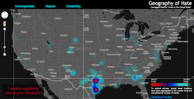
All together, the students determined over 150,000 geotagged tweets with a hateful slur to be negative. Hateful tweets were aggregated to the county level and then normalized by the total number of tweets in each county. This then shows a comparison of places with disproportionately high amounts of a particular hate word relative to all tweeting activity. For example, Orange County, California has the highest absolute number of tweets mentioning many of the slurs, but because of its significant overall Twitter activity, such hateful tweets are less prominent and therefore do not appear as prominently on our map. So when viewing the map at a broad scale, it’s best not to be covered with the blue smog of hate, as even the lower end of the scale includes the presence of hateful tweeting activity.
Even when normalized, many of the slurs included in our analysis display little meaningful spatial distribution. For example, tweets referencing ‘nigger’ are not concentrated in any single place or region in the United States; instead, quite depressingly, there are a number of pockets of concentration that demonstrate heavy usage of the word. In addition to looking at the density of hateful words, we also examined how many unique users were tweeting these words. For example in the Quad Cities (East Iowa) 31 unique Twitter users tweeted the word “nigger” in a hateful way 41 times. There are two likely reasons for higher proportion of such slurs in rural areas: demographic differences and differing social practices with regard to the use of Twitter. We will be testing the clusters of hate speech against the demographic composition of an area in a later phase of this project.
Perhaps the most interesting concentration comes for references to ‘wetback’, a slur meant to degrade Latino immigrants to the US by tying them to ‘illegal’ immigration. Ultimately, this term is used most in different areas of Texas, showing the state’s centrality to debates about immigration in the US. But the areas with significant concentrations aren’t necessarily that close to the border, and neither do other border states who feature prominently in debates about immigration contain significant concentrations.
Ultimately, some of the slurs included in our analysis might not have particularly revealing spatial distributions. But, unfortunately, they show the significant persistence of hatred in the United States and the ways that the open platforms of social media have been adopted and appropriated to allow for these ideas to be propagated.
Funding for this map was provided by the University Research and Creative Activities Fellowship at HSU. Geography students Amelia Egle, Miles Ross and Matthew Eiben at Humboldt State University coded tweets and created this map.
Autodesk has signed a definitive agreement to acquire Tinkercad, an easy-to-use browser-based 3D design tool. The addition of Tinkercad to Autodesk will help broaden the popular Autodesk 123D family of apps and supports Autodesk’s vision to help anybody imagine, design and create anything. The acquisition will also revive the Tinkercad service and community, despite a previously announced shutdown by its founders and creators.
“Tinkercad is a natural extension of the Autodesk 123D family as well as our other apps and services for consumers, as it is already used alongside Autodesk products”
“We are excited to have reached an agreement with Autodesk that will provide a solid home and bright future for Tinkercad,” said Kai Backman, founder of Tinkercad. “We found in Autodesk a shared vision for empowering students, makers and designers with accessible and easy to use software, and with their global reach and expertise in democratizing design, we’re confident in their ability to introduce Tinkercad to new audiences around the world.”
According to the announcement, Autodesk intends for the Tinkercad service to remain available as part of its consumer portfolio. The company also intends to incorporate elements of the Tinkercad technology and user experience into the Autodesk 123D family of products as part of its ongoing effort to make 3D design easier and more accessible to everyone. The transaction is expected to close within the next 30 days.
“Tinkercad is a natural extension of the Autodesk 123D family as well as our other apps and services for consumers, as it is already used alongside Autodesk products,” said Samir Hanna, Autodesk vice president, consumer products. “We look forward to welcoming the Tinkercad community to Autodesk and to continuing their mission of accessible 3D design for all.”
The Berlin-based software company skobbler introduces GPS Navigation & Maps for Android. Available starting today, Skobbler’s Android app is the first on-and offline-enabled mapping and navigation app for Android smartphones and tablets. Skobblertypisch is offered at a competitive price. For only one euro customers receive the full global online functionality and a whole country of choice for offline installation, which it is available without an Internet connection. Owners of the full version can expand additional areas offline at any time. OpenStreetMap maps used in the app can be stored locally on the smartphone or deleted and available online after purchase – depending on requirements and storage capacity of the mobile device.
The features of GPS Navigation & Maps at a glance:
– Fully-fledged navigation with voice guidance for car navigation (turn-by-turn)
– Fully interactive OpenStreetMap Map
– A single card with worldwide coverage
– Hybrid: Full functionality with and (after installation) without internet connection (online + offline)
– Installability whole countries included the City Maps (WiFi recommended)
– super fast reloading the map – zoom, rotate, etc. without reloading
– Continuous free map updates
– Powerful card technology (NGx)
– route display (cars, pedestrians)
– Convenient route options for adequate routing (fastest, shortest, most efficient route )
– Multiple map styles (day, night, outdoor) for the best possible user experience in any situation
– 2D and 3D view (with navigation)
– Various search options (address search, category search, proximity search)
– IdeaLog for feedback to the developers
– Comfortable favorites lists
– Optional Synchronization of favorites with the web portal maps.skobbler.com
– “avoid highway” function
– “Avoid toll roads” function
– App works in portrait and landscape format
– Full compatibility with smart phones and tablets
– one land card with purchase already included
“Our users can rejoice: Instead of having to fumble around with annoying hundreds of individual maps, GPS Navigation & Maps offers the whole world as a map and navigation from within an app,” said Marcus Thiel King of skobbler.
Being a person who enjoys spending time in the field using RTK and DGPS, I followed up on my column last month, “Sources of Public, Real-time, High-Precision Corrections,” with a trip to the field to test the NGS CORS Streaming service. About a month ago, I made a trip to Colorado to attend the Space Weather Workshop in Boulder, stop by the SPAR conference in Colorado Springs, and visit with some of my colleagues in the Denver area.
When I arrived in Denver, my plan was to meet Tim Smith (GPS Coordinator for the U.S. National Park Service) and travel to the Bakerville GPS test site in the Rocky Mountains, which was at about ~11,000 feet in elevation. My intent was to test the CORS Streaming and PBO real-time streaming that I discussed last month to better understand the accuracy and reliability of those services.
I arrived at the Denver airport early on a Monday ready to rock and roll into the Rockies with some high-precision GNSS equipment. As it turned out, I was denied. In Colorado, the weather is dynamic. It was quickly degrading when I arrived in Denver. Snow was definitely in my future for the next few days. Tim made the decision that we shouldn’t travel to Bakerville. The reason for Tim’s trepidation wasn’t necessarily due to the weather in Bakerville, but rather that the I-70 Interstate might turn into a parking lot and we’d be stuck in traffic for a few hours. Fair enough. The backup plan was to do some local testing in the parking lot adjacent to Tim’s office in Denver.
Tim invited Mel Philbrook to join us. Mel is a long-time GNSS technologist who works for the local Trimble dealer. He brought an SUV full of Trimble GNSS equipment, including one of the new R10 GNSS units as well as a GeoXH handheld with an external antenna.
Mel also had an Intuicom RTK Bridge in the trunk of his SUV that facilitated the different sources of RTK reference data we could use. He could switch from CORS Streaming to the local VRS via NTRIP to UHF at the flip of a switch, sending corrections to both the R10 and the GeoXH. I was particularly interested in seeing how the units performed using CORS Streaming, which is/was a free RTK service (single baseline) that was in beta test phase. In Oregon, I don’t have access to CORS Streaming because the only CORS Streaming station west of the Mississippi River is in Boulder, Colorado. The station is TMGO (Table Mountain CORS).
The baseline distance from TMGO to our location was about 55 km. The R10 was reporting a horizontal precision of about 4 cm. Not bad for a 55-km baseline. I didn’t compare the results to a survey mark (shame on me, but keep reading because I get to that) so I’m trusting the R10’s precision estimate. Tim said he’s run the test before using a GeoXH and a longer baseline and saw sub 10-cm horizontal precision. It’s not what the typical person using short baseline or RTK network is accustomed to, but for the high-precision GIS user who’s mapping utility, transportation, and infrastructure, that’s pretty darn good.
Tim, Mel and I spent an hour or so messing around with the equipment before packing it up. Not a very scientific study, but it confirmed that CORS Streaming was accessible via NTRIP and reasonably accurate.
In the meantime, the snow wasn’t letting up. This is the view as I was leaving Tim’s office to head to Boulder for the Space Weather Workshop:
I wasn’t finished with my CORS Streaming testing yet. My experience at Tim’s office gave me enough confidence to allocate time later in the week to conduct a more detailed test after the Space Weather Workshop. Hopefully, the weather would cooperate (call me a fair-weather field guy).
Space Weather Workshop
Every April, NOAA’s Space Weather Prediction Center in Boulder hosts the Space Weather Workshop (SWW), a gathering that has evolved into the leading conference in the U.S. for space weather-related topics. It attracts attendees, experts and speakers from all over the world. The discussion isn’t centered on GNSS, but GNSS certainly is a topic that is discussed. This year’s central topic was the electric power grid. You can view the SWW program here.
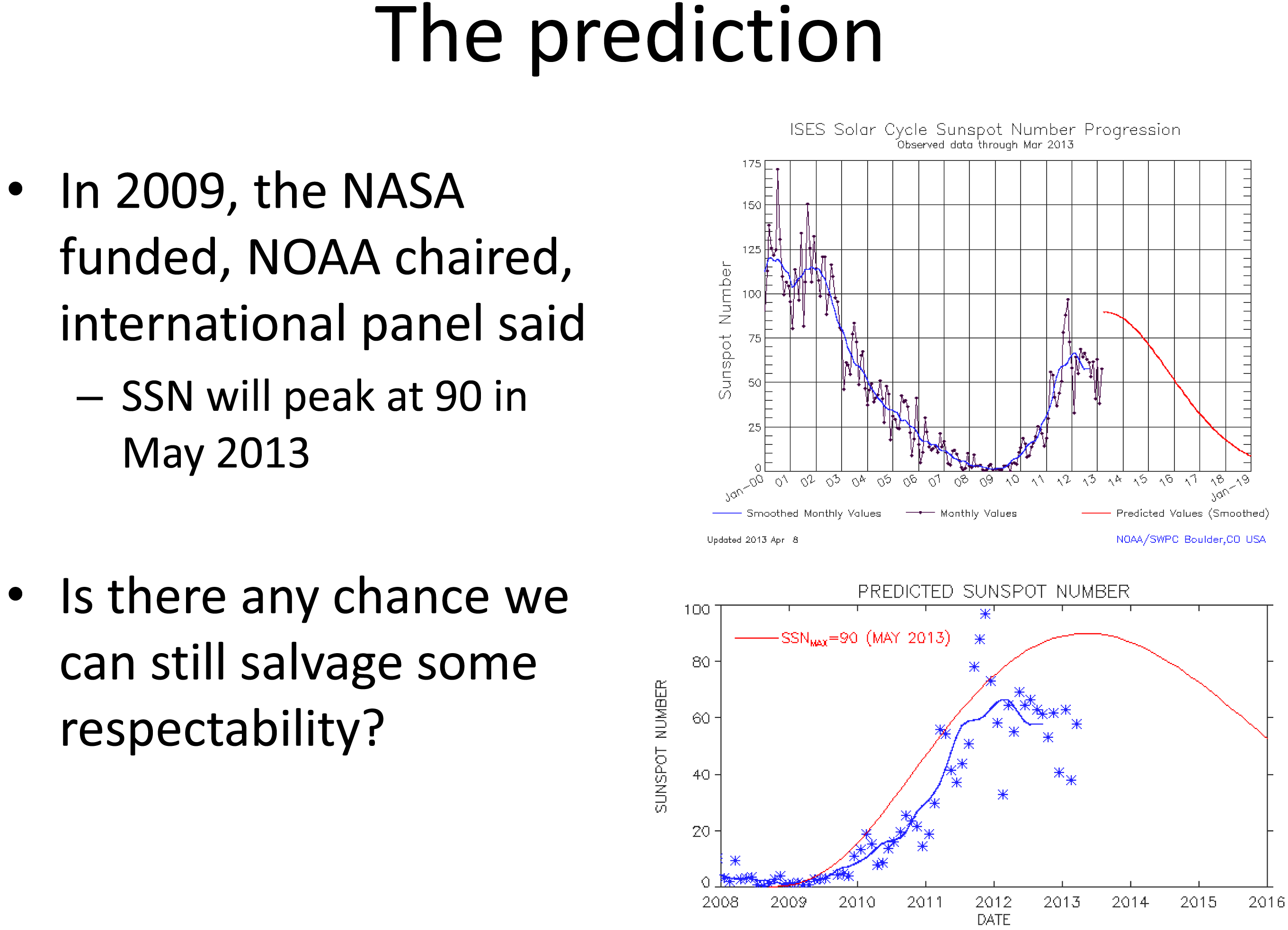
Believe it or not, this month (May 2013) was the predicted “solar maximum” for the current solar cycle (Solar Cycle 24, an 11-year cycle). However, Solar Cycle 24 has been unexpectedly weak. See the following slide presented by Doug Bisecker of the Space Weather Prediction Center. Doug is the Chairman of the Solar Cycle 24 Prediction Panel. His question, “Is there any chance we can still salvage some respectability?” speaks volumes about the difficulty in predicting space weather.
Source: Doug Bisecker presentation at the 2013 Space Weather Workshop
From the above, you can see the actual number of sun spot occurrence has been significantly less than predicted. Although sun spots aren’t what cause GNSS receivers to have problems, sun spots can indicate the amount of solar activity, which can be related to geomagnetic storms. Geomagnetic storms disturb the ionosphere and are the events that cause the most problems for GNSS receivers. Looking at the top chart above, you can see the difference in activity between the last solar maximum (peaked in early 2002) and today. The difference is clearly significant.
Does this mean we, the high-precision GNSS users, get a free pass on Solar Cycle 24?
Not at all.
Historically speaking, the most extreme geomagnetic storms (e.g., Oct/Nov 2002) have occurred after the solar maximum so our sensitivity to this issue should be keen for the next two years. Furthermore, there are orders of magnitude more high-precision GNSS receivers being used than ever before, and in mission-critical applications such as auto-steer in machine control (agriculture, construction, etc.). Most GNSS high-precision users today haven’t experienced the effects of an extreme geomagnetic storm. For a short primer on the effects of solar activity on GNSS/GPS, you might want to take a look at this article I wrote in 2008 as well Richard Langley’s 2011 Innovation column “GNSS and the Ionosphere.” In addition to the content, they both contain some valuable links to relevant articles.
In line with a goal of the workshop, a panel of GNSS professionals looked at issues that users face as they go about their business at solar max. The panel was “Global Navigation Satellite System (GNSS) Services: Research Needed to Fill Operational Gaps.” Joe Kunches (SWPC) moderated the panel that included Dr. Geoff Crowley (Astra), Dr. Anthea Coster (MIT), Capt. Steven Miller (USAF) and myself. We highlighted precision GNSS, satellite navigation for commercial aviation (ADS-B), and current work to better understand the errors the ionosphere imposes on user activities.
Something else I learned at the conference was how tough ionospheric scintillation is on GNSS receivers in Brazil. I feel for those users. When I mentioned I was traveling to Chile for an RTK project, the scientists said it is worse in Chile than the U.S., but still not as bad as Brazil. I’ll be very interested to experience how different it is than the U.S. (or other parts of the world where I’ve traveled).
I keep a pretty close eye on space weather and in contact with NOAA’s Space Weather Prediction Center. When I hear of a space weather event that may affect high-precision GNSS/GPS receivers, I send out a Tweet with the hashtag #SolarActivity. You can follow me on Twitter at https://twitter.com/GPSGIS_Eric.
From Space Weather Back to Local Weather
As the week progressed during the Space Weather Workshop, the snow continued. Boulder looked like Christmas in April.
I really wanted to spend some more time in the field to test the accuracy of the NGS’s CORS Streaming service and I was running out of time. In order to perform the test the way I wanted, I needed to find a local NGS survey mark that was observed using GPS. I checked out the NGS survey mark database and got lucky. There was one (PID = KK2060) located on a vista point parking area off of Highway 36 on the way from my hotel to the Space Weather Workshop. I couldn’t have asked for a better or more convenient survey mark location. I was planning to use a Bluetooth GNSS receiver so I could actually collect data while sitting in my car.
On Thursday morning, Mother Nature cleared her skies for me so I drove to the vista point. Remember, there’s a couple of feet of snow on the ground, so I was really hoping to see some kind of wood lathe that would get me close to the survey mark (no, I didn’t preload the KK2060 coords in my GPS L). Fortunately, a wood stake was near the survey mark. However, I didn’t have a shovel or a metal detector so it was either using my hands to shovel and search under two feet of snow for the mark, or…thanks to the rental car company, the car came with a healthy-sized windshield scraper. After 15 minutes of digging in the snow with a windshield scraper, I found KK2060. I’m sure to the people parked on the vista enjoying the view; I looked very suspicious using a windshield scraper to dig a hole in the snow. I wouldn’t have been surprised if a state trooper had shown up.
KK2060 recovered from under two feet of snow with a windshield scraper.
My final challenge was…no tripod or tribrach. I travel light and didn’t want to pack a set and, of course, I forgot to ask Tim if I could borrow a set. It’s never a good idea to set a GNSS antenna directly on the ground, but the antenna was small (<3” in diameter) and I did have a 5” diameter ground plane with about a 1” post. I was able to place it over the survey mark with reasonable confidence.
As I mentioned before, I was using a Bluetooth GNSS receiver (GPS L1/L2, GLONASS), the SXBlue III GNSS.
To collect the data, I was using an SXPad handheld with an AT&T SIM card for the Internet connection. For data-collection software, I used VisualGPSce, a free GPS data-collection program that collects and displays raw NMEA data. Although it doesn’t display enough digits of precision for the horizontal position, it accomplishes the simple task of collecting NMEA-formatted data without applying any transformation so I get the raw NMEA-formatted data from the receiver. It also displays some useful information such as PDOP, RTK indicator and elevation.
The last piece of data-collection software I used was a free NTRIP client software written by the SXBlue people called SXBlue RTN. I needed an NTRIP client software to access the CORS Streaming mount point. The software manages the IP address, port and login/pwd of the CORS Streaming system.
Logging into the NGS CORS Streaming site was painless, and within a few seconds I had an RTK FIXed position from the GNSS receiver, all from the comfort of my rental car, thanks to long-range Bluetooth. I collected ~45 minutes of NMEA data (1-Hz data rate) without interruption.
When I returned to the office, I began the process of comparing the results from CORS Streaming to the NGS survey mark coordinate. I checked with NGS and they reported that CORS Streaming is referenced to the ITRF00 (epoch 1997.0) datum. The KK2060 coordinate is published in NAD83/2011 (epoch 2010.0). I needed to reconcile the datum difference before performing any analysis so I used the NGS HTDP (Horizontal Time Dependent Positioning) online tool to accomplish this.
Finally, I used NMEA Analyzer (custom-built software for performing statistical analysis on GNSS NMEA data to NSSDA horizontal accuracy standards) to calculate accuracy (not precision) values of the data. I set up the NMEA Analyzer software to randomly select 200 epochs out of the ~2,700 collected to mitigate any bias due to filtering or other receiver “tricks”. Following are the horizontal results:
Not bad for an antenna sitting on the ground and an 18-km baseline using a $6,000 GNSS receiver and a free RTK base station. Folks, this is the direction that GNSS technology is heading. The continued proliferation of high-precision GNSS infrastructure (RTK networks, real-time PPP, etc.) and the falling prices of RTK GNSS receivers will dramatically increase the availability of high-precision technology to those who previously could not afford to make the investment.
I didn’t get a chance to test the PBO real-time streaming while I was in Colorado, but fortunately there are many PBO real-time stations that I can test from the comfort of my home office here in Oregon. In fact, there are so many in Oregon and Washington that I can test many different baseline distances to understand what accuracy users can expect. Look for my test results on that sometime this summer.
National Geodetic Survey (NGS) Suffering
Only a week after I did my field test of NGS’ CORS Streaming system in Colorado, NGS announced it was shutting down the CORS Streaming service effective April 26. On April 23, NGS issued the following notice by email:
*********************************************
The National Geodetic Survey’s prototype Real Time GNSS Data Service (Streaming CORS) will be discontinued effective April 26, 2013. The prototype was introduced a few years ago as a small research project to gauge interest and usage as well as test a proof of concept with the RTCM communities. However, due to low usage of this prototype service and staff limitations within the National Geodetic Survey, we have decided to discontinue the prototype. There were many contributing factors that lead to this decision but the following recent series of events has had a significant impact on project support and operations:
— Funds were cut due to sequestration and rescission
— Upcoming furloughs will impact all National Geodetic Survey Personnel
— A NOAA-wide hiring freeze is in effect
— Our only real-time expert will retire on April 30, 2013
If you have any questions or comments to share, please contact Neil Weston at 301-713-3191 or by email – [email protected].
*********************************************
I think the action was premature. Hardly anyone knew about the CORS Streaming service and it was only deployed in a small number of locations, which was not enough to cover a significant geographic area or major metro areas.
Nonetheless, I think this action points to bigger problems at the NGS. To all of us in the U.S. (and those in other countries), the NGS has been a tremendous source of GNSS technical expertise, products and services. The problem is that they are losing expertise at a faster rate than they are gaining. Just in the past few months, Dave Doyle and Bill Henning have both retired. Those two were a big part of the NGS user community outreach “boots on the ground” effort.
Furthermore, as the notice indicates, NGS’s only “real-time expert” (Bill Henning) is now retired. That’s a problem. As real-time, high-precision GNSS is gaining traction quickly in industries beyond surveying and engineering, the resources for NGS to support this trend should also expand, not contract. On the other hand, the use of GNSS post-processing is not increasing, yet NGS has loads of resources allocated to support post-processing. As technology trends shift, resources need to be redistributed in alignment with those trends.
The Future of NDGPS Open for Public Comment
The U.S. NDGPS program is on the chopping block again. However, this time it’s much more serious. The last time this issue surface was in 2007 when funding for some of the NDGPS sites was being threatened. At that time, only some of the inland sites were facing decommissioning. The U.S. Coast Guard DGPS part of NDGPS was safe and funded.
However, that’s not the case this time. Even the U.S. Coast Guard is starting to question the value of the DGPS system it created and has been using for more than 15 years. The FAA’s WAAS (Wide Area Augmentation System) has proven to be a viable alternative to NDGPS and is used by thousands of sport mariners and commercial marine pilot associations across the U.S., as well as high-precision users in GIS and surveying/engineering. To further complicate the issue, the use of GLONASS is not supported by NDGPS. Like what we’ve seen in high-precision surveying/engineering receivers, GLONASS is becoming an important feature in receivers used by commercial mariners who have to deal with terrain and structures that impede satellite visibility. Even though WAAS doesn’t support GLONASS, some newer GNSS receivers are able to integrate GLONASS data into the WAAS solution, further increasing the value of WAAS over NDGPS.
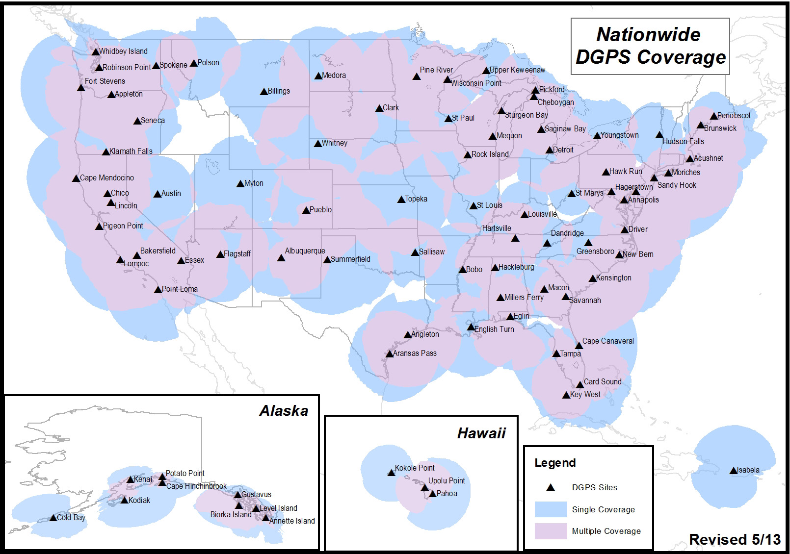
It’s likely that you aren’t an NDGPS user, but you might still be affected if the NDGPS is decommissioned. There are a total of 86 NDGPS stations across the Continental U.S., Alaska and Hawaii. As well as being NDGPS signal broadcasters, they are also part of the NGS CORS program that is used by the NGS’s OPUS online post-processing service. If you are using OPUS or NGS CORS for post-processing, you might be using NDGPS CORS data and not realize it. Following is a map of all NDGPS stations in the U.S.:
U.S. NDGPS coverage map.
If you’re interested in reading an explanation from the U.S. Coast Guard and Department of Transportation about the request for public comment and submitting a comment, click here. To be considered, comments must be submitted by July 15.
The White House Blog announced that President Obama signed an Executive Order directing historic steps to make government-held data more accessible to the public and to entrepreneurs and others as fuel for innovation and economic growth. The Executive Order declares that information is a valuable resource and strategic asset for the Nation.
Under the terms of the Executive Order and a new Open Data Policy released today by the Office of Science and Technology Policy and the Office of Management and Budget, all newly generated government data will be required to be made available in open, machine-readable formats, greatly enhancing their accessibility and usefulness, while ensuring privacy and security.
According to the announcement, during his visit to Austin, President Obama will meet with technology entrepreneurs who are hiring workers with cutting-edge skills and creating the tools and products that will drive America’s long term economic growth. This includes technology entrepreneurs utilizing government data to grow their company. Under the President’s Open Data Executive Order, more data will be made available allowing these types of entrepreneurs and companies to take advantage of this information, fueling economic growth in communities across the Nation.
Through the Data.gov platform, which launched in 2009, users can access government datasets about a wide array of topics. Thousands of datasets have already been added to Data.gov and more than half-a-million data downloads have occurred in the last year alone, and we’re working to make the site even better.
The Blog reports that as part of the Administration’s Digital Government Strategy and Open Data Initiatives in health, energy, education, public safety, finance, and global development, agencies have been hard at work unlocking valuable data from the vaults of government. The Health Data Initiative, for instance, has opened growing amounts of health-related information in open, machine-readable formats. Hundreds of companies and nonprofits have used these data to develop new products and services that are helping millions of Americans and creating jobs of the future in the process.
As part of the Administration’s work to make health care system more affordable and accountable, the Department of Health and Human Services released new data on fees that hospitals charge, a major step in creating greater price transparency.
“We’ve also collaborated with the private and nonprofit sectors through a series of White House datajams and datapaloozas to help spark activity by entrepreneurs and innovators to use open data to build new products, services, and innovations. As a result, there are private companies using open data to fight credit card fraud; consumers using open data to save on their energy bills; families leveraging open data to compare health care options; and a host of new apps and tools in areas ranging from public safety, to financial planning, to education, and more.”
The Blog reports hat many government datasets are still hard to find or are locked-up in unusable formats. By requiring that government agencies provide newly generated government data in machine-readable formats like CSV, XML, and JSON and, when appropriate, expose data via Application Programming Interfaces (APIs), the new Executive Order and Policy will further accelerate the liberation of government data.
OpenStreetMap, the user-created map used by many of the biggest sites on the web, has today unveiled an entirely new editor that makes it easier to contribute than ever before.
According to the announcement, the new editor, codenamed ‘iD’, boasts an intuitive interface and clear walk-throughs that make editing much easier for new mappers. By lowering the barrier to contributions, we believe that more people can contribute their local knowledge to the map – the crucial factor that sets OSM apart from closed-source commercial maps.
To accompany the expected growth in OSM’s contributor base, the OpenStreetMap Foundation is launching an appeal to fund new hardware for the project. The appeal aims to make the editing experience more resilient, so that the OSM community can continue producing the most extensive and up-to-date map of the world. You can donate online at donate.openstreetmap.org.
“OpenStreetMap’s growth in the past two years has been phenomenal,” explained Simon Poole, chairman of the OSM Foundation. “We’ve seen an explosion in the amount of local knowledge our mappers contribute to the map. This has encouraged more and more big-name websites and apps to switch to OpenStreetMap, while also enabling map hackers and geo enthusiasts the world over to build startling, imaginative visualisations from our open data.”
“Now, with the new editor and our plans for new hardware, we’re stepping up another level to make OpenStreetMap, not Google, the default choice for mapping and map data.”
OpenStreetMap reports that the new iD editor is a pure HTML5 experience, using the cutting-edge D3 visualisation library. Behind the clear design and intuitive interface is a sophisticated back-end that automatically recommends the most popular ‘tagging’ conventions used by the OSM community.
According to the announcement, development began as a community project in July 2012, and has since been taken forward thanks to a $575,000 grant from the Knight Foundation, with development being co-ordinated by MapBox – one of several companies which offer commercial services on OpenStreetMap’s open data.
From later today, new OpenStreetMap reports that users with a modern browser will automatically use the new iD editor. Users can switch between this and the existing Flash-based Potlatch 2 editor (which is being refocused as a tool for intermediate users) using their settings page or the drop-down ‘Edit’ menu. Advanced desktop-based editors are also available.
The editor software is entirely open source, with code available on github under an ultra-permissive licence.
Demonstrating how location analytics can use big data, Critigen LLC along with partners Social & Scientific Systems, Inc., and Esri, has developed an informative Medicare application called Medicare Mapper. Just released in the Apple App Store, it is a free download for the iPad. Based on a publicly available data set from the U.S. Department of Health & Human Services’ Centers for Medicare & Medicaid Services (CMS), the application allows consumers to see where people in their area are going for Medicare services, and service providers to see where their patients live along with the relative amount of services they received. It quickly and easily illustrates geographic patterns in Medicare hospital inpatient expenditures and exemplifies the power of location analytics for healthcare.
According to the announcement, based on the 2011 version of the Hospital Service Area file, the application makes anonymous data available on health services, service providers, utilization, and costs in an intuitive tablet interface. A total of 990,455 records, represented by a string of numbers, were decoded and geo-enabled with help from the U.S. Census Bureau’s ZIP code file and population data from Esri. It describes every Medicare Hospital Inpatient Admission that occurred in the country in 2011. Included is the residency (ZIP code) of the beneficiary, the hospital provider that received the reimbursement, the total amount of the reimbursement, the total length of stay, and the total number of cases that originated from within the respective ZIP code. Using the totals described by the data, two more categories of data were averaged and included for each record.
Critigen reported that users can select a specific hospital and display its impact in terms of which ZIP codes their 2011 Medicare beneficiaries came from. If a ZIP code is selected, pins appear on the map to show what facilities were used by the beneficiaries living there. Another built-in capability compares two hospitals or two ZIP codes in a side-by-side manner. The differences of each category can then be viewed numerically or by percentage. These capabilities enable users to build the stories they need to produce understanding, build knowledge, research, or manage.
Medicare Mapper follows the 2012 release of Critigen’s Health Indicators app.
Mappt has introduced an Android app for technical and professional staff who need to record data in the field and then seamlessly integrate it with desktop GIS systems.
According to the announcement, the concept — developed by Perth-based remote sensing company Scantherma for Mappt — was born in the dusty outback of Western Australia.
“We were on a field trip into the bush as part of a client project and the tools we had were just not good enough,” said Amir Farhand, Scantherma’s CEO.
“We needed something more flexible that would be easier to use with a better battery life than a laptop. That’s where Mappt started, aimed at shifting GIS and mapping tools to a tablet without relying on other proprietary technology.”
The company reports that while it will not replace the desktop applications necessary for the storage and analysis of large volumes of data, Mappt will create a faster, simpler, lower cost and more flexible method for accurate field data processing and collection. Users range from geologists and environmental officers, field workers, through to outdoor enthusiasts and travellers.
After extensive testing and development, Mappt is available for the Android operating system. Android was chosen as the key development platform because of the closed nature of the Apple iOS. “Apple has some great features, but some big drawbacks as well,” said Mr Farhand.
“The locked file system really prevented us from doing what is needed in iOS, so we chose Android because it was able to do what the market needed. Our Beta tests have gathered some very positive feedback from users and we plan to continue developing the scope and flexibility of Mappt.”
Mappt reports that the software is compatible with a number of different GIS formats, Mappt provides an application layer for both amateurs and professionals to integrate information gathered in the field into their existing GIS information databases. It can import and export a variety of different commercial and free-to-use vector and raster image file formats for the recording of information useful to technicians and professionals who need accurate geo-located information. One important feature is the use of real-time tracking which can be exported to a GIS system. By including this, field workers who are off the beaten track can easily find their way to and from previously visited locations without having to make or repeat mistakes, a feature very useful for mining exploration. In addition, this feature has applications in other industries and can be turned on and off as required.
Mappt is now available for download via the Google Play store. For more information, visit the Mappt website at www.mappt.com.au
Smartphone and tablet owners are spending less time using standalone consumer electronics (CE) devices according to new research study, “A Tale of Two Techs – Smartphone and Tablet Adoption and Usage,” released by the Consumer Electronics Association (CEA). The study shows consumers continue to use standalone electronic devices, such as digital cameras, but are reducing their usage time as a result of owning a smartphone or tablet.
According to the announcement, in households that own laptops, 43 percent of smartphone owners and 46 percent of tablet owners report spending less time with their laptops. However, very few users indicate they have stopped using their laptop computers altogether (one percent among smartphone owners, two percent tablet owners).
Compared to most standalone devices – with the exception of laptops – smartphones and tablets are being used more often and for more activities. Smartphones have become the primary device for taking pictures (78 percent), recording videos (74 percent), getting directions (69 percent), reading e-books (62 percent), listening to music (59 percent) and playing games (39 percent). Laptops and desktops remain the primary device smartphone and tablet owners use to browse the Internet, shop online, watch videos and view/edit documents.
The devices consumers indicate they are most likely to stop using altogether as a result of owning a smartphone and/or tablet are camcorders, portable audio/MP3 players, portable game devices, GPS or navigation devices and dedicated e-readers.
“Smartphones and tablets have enriched, diversified and transformed the ecosystem of consumer electronics,” said Rhonda Daniel, senior manager, market research, CEA. “As a result, mobile device owners are re-proportioning the time they spend using other standalone CE devices. While many single-function devices continue to play a distinct and relevant role in our digital lives, consumers are gravitating toward connected mobile devices able to perform multiple functions.”
An overwhelming majority of consumers are adopting smartphones and tablets in order to access the Internet. The study found that 85 percent of smartphone owners browse the Web and 89 percent check email on their devices. Among tablet owners, 92 percent browse the Web and 83 percent use their tablets to check email.
In addition, smartphones are frequently being used to take pictures (92 percent), make voice calls (91 percent) and navigate (76 percent). Conversely, tablets are used for more leisurely activities such as playing games (78 percent), watching videos (66 percent) and reading e-books (61 percent).