Aibotix GmbH, maker of a new generation of vertical take-off and landing unmanned aerial vehicles (UAV), announced that Leica Geosystems, a global leader in capture, modeling and visualization of 3D spatial information, has licensed the Aibotix X6 for worldwide distribution. Aibotix X6 features advanced, multi-sensor, intelligent guidance systems that make the X6 the safest and easiest to operate commercial UAV.
Aibot X6
According to the announcement, UAVs are becoming increasingly important in many of the applications served by Leica Geosystems’ solutions. These include agriculture, asset & facilities management, cadastral mapping, disaster & emergency management, engineering, environmental, forensics, general industrial, mining, and public safety. Unrestricted positioning of various measuring technologies will spawn new applications as the full potential of this transformative UAV technology unfolds.
“For many critical applications, access is risky, impossible or simply too time consuming using conventional methods or platforms,” said Rüdiger Wagner, General Manager of Solutions at Leica’sGeospatial Solutions Division. “We chose Aibotix because it is one of the best aerial platforms available for safe, reliable maneuvering of important payloads, not only in tight spaces,” he added. “This UAV mirrors the high standards for which our brand is known, making it the right choice for global distribution now. Going forward, I am confident that Aibotix with their strong product roadmap and skilled team are well positioned to keep leading the market with true innovations. That’s just what we need as we continueto think forward.”
Joerg Lamprecht, managing director of Aibotix, said, “Leica Geosytems is synonymous with spatial information products, and an ideal partner for distribution of our UAVs. This is exciting teamwork from two companies that deliver pioneering solutions to difficult problems, especially when one has been doing so for nearly 200 years. Existing segments will be benefit and new markets will be discovered as great products from Leica Geosystems reach new heights in more places on Aibotix UAVs.”
Under this arrangement, Aibotix reports that it remains an independent company with direct sales and additional distribution channels in other markets. Information about Aibotix X6’s performance specifications is available at www.aibotix.com.
Avenza Systems Inc., producers of MAPublisher cartographic software for Adobe Illustrator and the PDF Maps mobile app, announces the release of Geographic Imager 4.2 for Adobe Photoshop. New formats are supported, including writing to the DEM TIFF format which saves raw DEM values and exporting web tiles to Google Maps or Microsoft Bing Maps format.
This release is available at the Geographic Imager Basic license level which provides support for the geospatial framework in Adobe Photoshop as well as limited import and export abilities at an introductory price level. Also new in this release is the addition of the Georeference feature with the Geographic Imager Basic license.
“We’ve been working on some very innovative features lately, one of them being the ability to export web tiles using Geographic Imager from Adobe Photoshop,” said Ted Florence, President of Avenza. “The web tiles are compatible with several online map services which allows our users to spend less time worrying about image referencing and more time creating online mapping solutions,“ he added. “Another great feature in this release is the new ability to save to the DEM TIFF format, which is interoperable and can be reopened in Geographic Imager or in other geospatial software packages. There has been a demand for extended format support and we’re continuing to listen to our users’ needs.”
Features:
Available Geographic Imager Basic license
DEM TIFF write support, format saves raw DEM values
Ability to Export Web Tiles to Google Maps or Microsoft Bing Maps format
Geographic Imager panel improvements, including new Survey and Ruler tabs
Crop by Vector File Extents, use the geographic extents of a vector file to crop an image
Streamlined user interactions with command boxes and simpler messages
Various bug fixes and user experience enhancements.
Geographic Imager is software for Adobe Photoshop that leverages the superior image editing capabilities of raster-based image editing software and transforms it into a powerful geospatial imagery editing tool, Avenza said. Work with satellite imagery, aerial photography, orthophotos, and DEMs in GeoTIFF and other major GIS image formats using Adobe Photoshop features such as transparencies, filters, and image adjustments while maintaining georeferencing and support for hundreds of coordinate systems and projections.
Geographic Imager 4.2 is immediately available and free of charge to all Geographic Imager Maintenance Program members and at US$319 for non-maintenance upgrades. New fixed licenses start at US$699. Geographic Imager Basic licenses start at US$199. Academic and volume license pricing are also available. Geographic Imager 4.2 is compatible with Adobe Photoshop CS5, CS5.1 and CS6. Visit www.avenza.com/geographic-imager for more information.
In an ambitious geospatial project, San Jose State University and local non-profit Garden to Table joined forces to connect families in need with excess local produce. This urban-forestry-meets-agriculture project enabled the group to more than double its collection and distribution of fresh produce, feeding the hungry with fruits grown locally in private yards and gardens.
Food security is a growing social and economic challenge that knows no political boundaries. Even in the United States, an astonishing 18 million households were labeled “food insecure” in 2011 because they lacked the means at some point during the year to feed all of their members. The negative impacts of food insecurity can range from poor academic performance and rising healthcare costs to increased crime and social unrest.
San Jose State University (SJSU) in California has teamed with Trimble Navigation Ltd. to deploy a high-tech solution that enhances the local community’s ability to put fresh food on the tables of families in need. Leveraging a variety of web-based GIS, geospatial, and mobile GPS technologies, the solution makes it easier for local organizations to manage productive forestry and agriculture programs in the urban setting.
Garden to Table volunteer collects fruit tree data with the Trimble Juno handheld.
“Bringing food production back into our cities and suburbs has significant environmental, economic and social benefits,” said Hilary Nixon, associate professor in the SJSU Department of Urban and Regional Planning. “A healthier community is one of those benefits.”
SJSU and the City of San Jose have jointly formed an organization they call CommUniverCity that brings together students, faculty, city staff and members of the local community to assist nearby neighborhoods in a variety of initiatives. One of these is Garden to Table, which deployed the Trimble Urban Forestry solution to feed the hungry with fruits grown locally in private yards and gardens.
Because of the increased efficiencies achieved by superior data collection and organization, Garden to Table was able to halve the amount of time it took to catalog, organize, and map Central San Jose’s Fruit Trees, leading to more time in the field, and a projected increase of 100 percent more fruit in 2013, or roughly 25,000 pounds. Plans call for all of the fruit being delivered to families within a couple of miles of where it is grown.
Greater consumption of locally grown healthy foods isn’t the only advantage of improved urban forestry, explained Nixon. She believes the same technology used by SJSU and Garden to Table to feed the needy in San Jose can be used by local governments to better manage trees in public spaces along residential streets and in city parks, further contributing to a healthier community.
Gathering Leftover Fruit
The mild climate and generous rainfall in San Jose are ideal for fruit trees, many of which were planted decades ago on residential properties. Now mature, these trees typically yield more citrus and stone fruits than one household can possibly consume, the remainder often rotting on the branches or on the ground. Concerned by the fact that much of fruit went to waste, an informal group called Neighborhood Fruit Pickers sought permission of property owners to glean the excess for distribution to food banks.
Garden to Table offered to support the Pickers in 2011 seeing an opportunity to leverage the university’s GIS resources to make the urban harvesting process more productive, said Zach Lewis, Garden to Table’s project coordinator and a graduate student in SJSU’s Urban Planning Department.
“We started mapping the fruit trees with pen and paper, walking the streets and collecting data—address, tree type, productivity and size,” said Lewis. “Then I would geocode the data and drop it into the GIS…that was incredibly time and labor intensive.”
Although the City of San Jose shared up-to-date parcel layers from its GIS for the university to use in its own ArcGIS system, the field data collection proved to be a flaw in overall efficiency. Not only was field work time consuming, mistakes were being made both in inconsistent data collection and in the entry of field notes into the GIS back on campus. These notes included hand-written location coordinates for each tree captured in the field with a simple hand-held GPS unit.
Despite these issues, Lewis and fellow volunteers mapped 930 trees on private properties within a mile radius of campus in the first year. Personnel time in the field and at the keyboard totaled more than 300 hours. Although the mapping and subsequent GIS analysis helped improve efficiency of the harvests, Lewis and Nixon saw potential in further automating
the process.
With close ties to SJSU, Trimble developed a three-part solution with a mobile GIS for data collection, a back-office application for geospatial data analysis, and a tree canopy monitoring segment for long- term planning.
More Efficient Tree Mapping
To create an integrated solution, participants contacted Cengea, a Trimble company in Vancouver, Canada, which offers a data management and visualization package specifically for forestry. This solution, called Cengea Forest, needed only minor customization to provide both mobile field and back-office analysis functionality for Garden to Table. The solution was up and running in less than two weeks.
“The mobile client application ran on handheld Trimble Juno SB GPS data collectors,” said Patrick Lefebvre, Cengea Manager of Customer Solutions. “Field crews were guided by a simple menu system that helped them record and inventory trees in the study area that could be harvested…accurately recording GPS location and key attributes such as species, size and productivity.”
Cengea Urban Forest displays Garden to Table fruit tree locations on a parcel base map layer.
Training the volunteers to use the mobile data collectors took just a few minutes because the attribute menus were mostly point-and-click. These sessions focused on educating the crews to correctly identify San Jose’s nearly two dozen species of fruit trees, each named in the pull-down menu. Jotting down location coordinates for each tree was eradicated because the mobile GIS application on the Juno automatically recorded those points as feature attributes. Collected data was uploaded by Wi-Fi into the back-office piece of the application.
According to Garden to Table’s Lewis, efficiency and accuracy saw immediate improvements in the tree mapping portion of the project. Compared to pen-and-paper, the crews gathered tree data much faster in the field, and errors in transcription
were eliminated by digital upload to the database.
“With the mobile solution, we mapped 1,400 trees and did that in roughly 160 hours,” said Lewis, noting this represented almost 50 percent more trees mapped in half the number of hours, and in only four weeks compared with 18 months the previous time. The process of collecting data in the field and then integrating it into the GIS manually was condensed into a single step thanks to digital data collection making it easy to pick-up and go.
Participants believe the most significant advantage of the automated solution will come this year with a boost in harvest productivity.
Running the Cengea data analysis and visualization application on the GIS, Garden to Table will query the tree inventory to show the most productive trees of a specific type on the digital parcel map layer. This will help them concentrate the volunteers in neighborhoods where the most fruit can be picked.
Community food bank recipients helped out with the harvest.
Further, the Cengea application contains background information on fruit tree species including peak production times which could be correlated with specific tree locations by street address on the parcel layer. Each week of traditional harvest times, Lewis will generate custom maps of the project area along with address lists showing his teams exactly where to go and glean fruits ready to pick.
“The application revolutionizes the way we are able to look at our tree data,” said Lewis.
Among the attributes collected during field work were condition and health of the trees. As a favor to participating citizens with fruit trees on their properties, Garden to Table will also create customized pruning schedules by species. Volunteers may use this information to notify the owners when their trees should be tended. The charitable organization hopes that better maintenance will improve yields in the future.
“Garden to table will use Cengea management tools to improve harvest and prune yields in the future because in the past Lewis printed maps and manually created routes,” said Trimble’s Rick Gosalvez. “With Cengea, he can query by fruit, by season, condition, and by productivity of inventory to make more informed decisions.”
Analyzing tree canopy for Future Growth The City of San Jose and Garden to Table share a common long-term goal of increasing the total number of trees in the San Jose area. While both organizations understand that more fruit trees will ultimately yield larger harvests, the university is eying a classic win-win situation for the community at large.
“Trees really make the city livable,” said Ralph Mize, San Jose’s City Arborist who serves as an advisor to the project. “They provide many positive benefits.” The concept of urban forestry dovetails perfectly with a green initiative started by the San Jose mayor in 2009. One of its goals is to plant 100,000 new trees across the city. SJSU’s Nixon explained that a rich and lustrous tree canopy in the urban and suburban setting has a positive impact on the local economy, environment and society. Trees boost property values, reduce air pollution, improve storm water drainage, and even encourage people to exercise more outdoors.
With fruit tree canopy inventory and monitoring in mind, the project team turned to Equinox Analytics Inc. of Bismarck, N.D., to add another component to the solution. Working with the Trimble eCognition software, the firm created a script that calculates fruit tree canopy coverage by analyzing high-resolution aerial orthoimagery and airborne LiDAR elevation data that had been acquired over San Jose and provided by the City to Trimble for the project.
“The Trimble eCognition software is ideal for performing complex analysis of large, high-resolution spatial data sets,” said Aaron Smith, Equinox Analytics President. First, the eCognition script identified areas of vegetation in the digital orthoimagery using information from the visible green spectrum. But this spectral information included all green vegetation – tree canopies, grass, and bushes. To separate out the trees, the script then correlated the visible green spectral class with the elevation points in the LiDAR data, eliminating vegetation shorter than five feet in height.
“This allowed us to calculate total tree canopy coverage in the [Garden to Table] project area,” said Smith. “We refined the analysis to focus on trees [with fruit] accessible by ladder, so the script eliminated trees taller than 25 feet.”
Trimble eCognition canopy and building footprint extraction in Five-Wounds Brookwood Terrace study area.
Smith output the tree data as a geo-referenced profile across the project area and provided this file to SJSU and Garden to Table. Nixon and Lewis hope to input the data into the GIS and cross- referenced known fruit tree locations with the canopy profile. From this information, they expect to more accurately measure the size of specific tree canopies, greatly enhancing their estimates of potential fruit production.
“The profile also showed where the tree canopy was particularly dense in other parts of the city, giving them an idea of where to focus their efforts to find fruit trees that hadn’t been mapped,” said Smith.
Lewis said that Garden to Table will use the fruit tree canopy map in the future as it moves into the next phase of its project — encouraging the planting of new fruit trees. Just as the canopy map shows where the trees are concentrated, it also reveals gaps where new ones would thrive. Nixon and Lewis plan to work with both city officials and private landowners to encourage planting trees where they can provide the most benefit.
Trimble’s Gosalvez sees the tree canopy monitoring piece of the solution as having significant long-term benefits for overall urban forestry/agriculture efforts in any city. The application provides a baseline of canopy coverage and then enables the end users to make rapid change detection measurements in the future to assess the success of policy initiatives designed to foster tree growth.
“This integrated solution provides all the tools needed for communities to beautify their environments, battle food insecurity and support healthier living in the face of a changing climate,” said Gosalvez.
(This feature originally appeared in Informed Infrastructure.)
Editor’s Note: The following is a blog post from a Humboldt State University Geography Lecturer Monica Stephens describing her students’ (Amelia Egle, Miles Ross, Matthew Eiben) tweet mapping project. While mapping Twitter content for disaster response is becoming commonplace, mapping cultural values is not. It’s a fascinating example of using GIS to map specific Twitter content.
UPDATE (5/13/13 @ 10:45pm): We have written and published a FAQ to respond to some of the questions and concerns raised in the comments here and elsewhere. Please review our comments there before commenting or emailing.Following the 2012 US Presidential election, we created a map of tweets that referred to President Obama using a variety of racist slurs. In the wake of that map, we received a number of criticisms – some constructive, others not – about how we were measuring what we determined to be racist sentiments. In that work, we showed that the states with the highest relative amount of racist content referencing President Obama – Mississippi and Alabama – were notable not only for being starkly anti-Obama in their voting patterns, but also for their problematic histories of racism. That is, even a fairly crude and cursory analysis can show how contemporary expressions of racism on social media can be tied to any number of contextual factors which explain their persistence.The prominence of debates around online bullying and the censorship of hate speech prompted us to examine how social media has become an important conduit for hate speech, and how particular terminology used to degrade a given minority group is expressed geographically. As we’ve documented in a variety of cases, the virtual spaces of social media are intensely tied to particular socio-spatial contexts in the offline world, and as this work shows, the geography of online hate speech is no different.
Rather than focusing just on hate directed towards a single individual at a single point in time, we wanted to analyze a broader swath of discriminatory speech in social media, including the usage of racist, homophobic and ableist slurs.
Using DOLLY to search for all geotagged tweets in North America between June 2012 and April 2013, we discovered 41,306 tweets containing the word ‘nigger’, 95,123 referenced ‘homo’, among other terms. In order to address one of the earlier criticisms of our map of racism directed at Obama, students at Humboldt State manually read and coded the sentiment of each tweet to determine if the given word was used in a positive, negative or neutral manner. This allowed us to avoid using any algorithmic sentiment analysis or natural language processing, as many algorithms would have simply classified a tweet as ‘negative’ when the word was used in a neutral or positive way. For example the phrase ‘dyke’, while often negative when referring to an individual person, was also used in positive ways (e.g. “dykes on bikes #SFPride”). The students were able to discern which were negative, neutral, or positive. Only those tweets used in an explicitly negative way are included in the map.
All together, the students determined over 150,000 geotagged tweets with a hateful slur to be negative. Hateful tweets were aggregated to the county level and then normalized by the total number of tweets in each county. This then shows a comparison of places with disproportionately high amounts of a particular hate word relative to all tweeting activity. For example, Orange County, California has the highest absolute number of tweets mentioning many of the slurs, but because of its significant overall Twitter activity, such hateful tweets are less prominent and therefore do not appear as prominently on our map. So when viewing the map at a broad scale, it’s best not to be covered with the blue smog of hate, as even the lower end of the scale includes the presence of hateful tweeting activity.
Even when normalized, many of the slurs included in our analysis display little meaningful spatial distribution. For example, tweets referencing ‘nigger’ are not concentrated in any single place or region in the United States; instead, quite depressingly, there are a number of pockets of concentration that demonstrate heavy usage of the word. In addition to looking at the density of hateful words, we also examined how many unique users were tweeting these words. For example in the Quad Cities (East Iowa) 31 unique Twitter users tweeted the word “nigger” in a hateful way 41 times. There are two likely reasons for higher proportion of such slurs in rural areas: demographic differences and differing social practices with regard to the use of Twitter. We will be testing the clusters of hate speech against the demographic composition of an area in a later phase of this project.
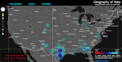
Perhaps the most interesting concentration comes for references to ‘wetback’, a slur meant to degrade Latino immigrants to the US by tying them to ‘illegal’ immigration. Ultimately, this term is used most in different areas of Texas, showing the state’s centrality to debates about immigration in the US. But the areas with significant concentrations aren’t necessarily that close to the border, and neither do other border states who feature prominently in debates about immigration contain significant concentrations.
Ultimately, some of the slurs included in our analysis might not have particularly revealing spatial distributions. But, unfortunately, they show the significant persistence of hatred in the United States and the ways that the open platforms of social media have been adopted and appropriated to allow for these ideas to be propagated.
Funding for this map was provided by the University Research and Creative Activities Fellowship at HSU. Geography students Amelia Egle, Miles Ross and Matthew Eiben at Humboldt State University coded tweets and created this map.
The Berlin-based software company skobbler introduces GPS Navigation & Maps for Android. Available starting today, Skobbler’s Android app is the first on-and offline-enabled mapping and navigation app for Android smartphones and tablets. Skobblertypisch is offered at a competitive price. For only one euro customers receive the full global online functionality and a whole country of choice for offline installation, which it is available without an Internet connection. Owners of the full version can expand additional areas offline at any time. OpenStreetMap maps used in the app can be stored locally on the smartphone or deleted and available online after purchase – depending on requirements and storage capacity of the mobile device.
The features of GPS Navigation & Maps at a glance:
– Fully-fledged navigation with voice guidance for car navigation (turn-by-turn)
– Fully interactive OpenStreetMap Map
– A single card with worldwide coverage
– Hybrid: Full functionality with and (after installation) without internet connection (online + offline)
– Installability whole countries included the City Maps (WiFi recommended)
– super fast reloading the map – zoom, rotate, etc. without reloading
– Continuous free map updates
– Powerful card technology (NGx)
– route display (cars, pedestrians)
– Convenient route options for adequate routing (fastest, shortest, most efficient route )
– Multiple map styles (day, night, outdoor) for the best possible user experience in any situation
– 2D and 3D view (with navigation)
– Various search options (address search, category search, proximity search)
– IdeaLog for feedback to the developers
– Comfortable favorites lists
– Optional Synchronization of favorites with the web portal maps.skobbler.com
– “avoid highway” function
– “Avoid toll roads” function
– App works in portrait and landscape format
– Full compatibility with smart phones and tablets
– one land card with purchase already included
“Our users can rejoice: Instead of having to fumble around with annoying hundreds of individual maps, GPS Navigation & Maps offers the whole world as a map and navigation from within an app,” said Marcus Thiel King of skobbler.
OpenStreetMap, the user-created map used by many of the biggest sites on the web, has today unveiled an entirely new editor that makes it easier to contribute than ever before.
According to the announcement, the new editor, codenamed ‘iD’, boasts an intuitive interface and clear walk-throughs that make editing much easier for new mappers. By lowering the barrier to contributions, we believe that more people can contribute their local knowledge to the map – the crucial factor that sets OSM apart from closed-source commercial maps.
To accompany the expected growth in OSM’s contributor base, the OpenStreetMap Foundation is launching an appeal to fund new hardware for the project. The appeal aims to make the editing experience more resilient, so that the OSM community can continue producing the most extensive and up-to-date map of the world. You can donate online at donate.openstreetmap.org.
“OpenStreetMap’s growth in the past two years has been phenomenal,” explained Simon Poole, chairman of the OSM Foundation. “We’ve seen an explosion in the amount of local knowledge our mappers contribute to the map. This has encouraged more and more big-name websites and apps to switch to OpenStreetMap, while also enabling map hackers and geo enthusiasts the world over to build startling, imaginative visualisations from our open data.”
“Now, with the new editor and our plans for new hardware, we’re stepping up another level to make OpenStreetMap, not Google, the default choice for mapping and map data.”
OpenStreetMap reports that the new iD editor is a pure HTML5 experience, using the cutting-edge D3 visualisation library. Behind the clear design and intuitive interface is a sophisticated back-end that automatically recommends the most popular ‘tagging’ conventions used by the OSM community.
According to the announcement, development began as a community project in July 2012, and has since been taken forward thanks to a $575,000 grant from the Knight Foundation, with development being co-ordinated by MapBox – one of several companies which offer commercial services on OpenStreetMap’s open data.
From later today, new OpenStreetMap reports that users with a modern browser will automatically use the new iD editor. Users can switch between this and the existing Flash-based Potlatch 2 editor (which is being refocused as a tool for intermediate users) using their settings page or the drop-down ‘Edit’ menu. Advanced desktop-based editors are also available.
The editor software is entirely open source, with code available on github under an ultra-permissive licence.
Mappt has introduced an Android app for technical and professional staff who need to record data in the field and then seamlessly integrate it with desktop GIS systems.
According to the announcement, the concept — developed by Perth-based remote sensing company Scantherma for Mappt — was born in the dusty outback of Western Australia.
“We were on a field trip into the bush as part of a client project and the tools we had were just not good enough,” said Amir Farhand, Scantherma’s CEO.
“We needed something more flexible that would be easier to use with a better battery life than a laptop. That’s where Mappt started, aimed at shifting GIS and mapping tools to a tablet without relying on other proprietary technology.”
The company reports that while it will not replace the desktop applications necessary for the storage and analysis of large volumes of data, Mappt will create a faster, simpler, lower cost and more flexible method for accurate field data processing and collection. Users range from geologists and environmental officers, field workers, through to outdoor enthusiasts and travellers.
After extensive testing and development, Mappt is available for the Android operating system. Android was chosen as the key development platform because of the closed nature of the Apple iOS. “Apple has some great features, but some big drawbacks as well,” said Mr Farhand.
“The locked file system really prevented us from doing what is needed in iOS, so we chose Android because it was able to do what the market needed. Our Beta tests have gathered some very positive feedback from users and we plan to continue developing the scope and flexibility of Mappt.”
Mappt reports that the software is compatible with a number of different GIS formats, Mappt provides an application layer for both amateurs and professionals to integrate information gathered in the field into their existing GIS information databases. It can import and export a variety of different commercial and free-to-use vector and raster image file formats for the recording of information useful to technicians and professionals who need accurate geo-located information. One important feature is the use of real-time tracking which can be exported to a GIS system. By including this, field workers who are off the beaten track can easily find their way to and from previously visited locations without having to make or repeat mistakes, a feature very useful for mining exploration. In addition, this feature has applications in other industries and can be turned on and off as required.
Mappt is now available for download via the Google Play store. For more information, visit the Mappt website at www.mappt.com.au
Applanix has introduced POSPac MMS v6.2, its latest generation of software for directly georeferencing mobile mapping sensors using GNSS and inertial technology. Featuring new Applanix IN-Fusion Multi-Single-Base Processing, POSPac MMS V6.2 is designed to improve the productivity and accuracy of mapping from mobile platforms in the air, on land or at sea, the company said.
IN-Fusion Multi-Single-Base Processing is designed for customers who need the highest level of differential GNSS position accuracy and perform long, linear projects such as power-line corridors, long highways or stretches of coastline. During these projects, a GNSS base station network may not be available, or the geometry of the network so weak that an Applanix SmartBase solution — which uses existing reference stations to achieve high accuracy over longer distances — is not viable. In these cases, IN-Fusion Multi-Single-Base Processing allows base stations to be established along the full length of the travel path and makes optimal use of the nearest base station at all times.
Customers can now take advantage of robust tightly coupled in-fusion processing without the need to break the project up into multiple segments for each base station to attain the highest accuracy, Applanix said.
“In addition to IN-Fusion Multi-Single-Base Processing, POSPac MMS V6.2 includes new features designed to increase productivity, efficiency and ease-of-use. The Coordinate Conversion tool included allows users to choose from a number of local reference frames for inputting base station coordinates,” said Edith Roy, Development Manager of POSPac MMS at Applanix. “POSPac MMS Version 6.2 demonstrates our commitment to providing customers with not only the most advanced software solutions for mobile mapping applications, but also the easiest to use.”
POSPac MMS V6.2 can be purchased through Applanix’ global sales network. The software is available as an upgrade to all POSPac users currently under a maintenance contract.
GIS is a platform for understanding our world. In the past, the data that fueled GIS was typically created to represent the state of the geoscape at a specific moment in time (“historic” or “current”; or “future” to represent a future modeled state). While this data has proven valuable for countless GIS applications and analyses, even the “current” snapshot falls out of sync with the real world quickly. In today’s fast-paced, constantly changing world, the “current” snapshot is outdated almost as soon as it is created.
A number of new technologies are combining to enable the real time collection of data, and the sharing of that data in real time with GIS. The result is a dynamic platform which enables real time visualization, analysis, and understanding of our world. This is the new age of real-time GIS.
Some of the new technologies enabling real-time GIS include:
GeoEvent Processor is a new ArcGIS for Server extension. It gives users the ability to connect to real-time data streams from a wide variety of sensors, perform continuous processing and analysis of those data streams, and send relevant information to users or other systems.
Geofencing is the creation of a virtual perimeter for a real-world geographic area. In the case of GeoEvent Processor, the GIS server is detecting and using geofences to issue an alert when a mobile device approaches, enters, and leaves the geofenced area (which can be based on any map feature). GeoTrigger technology will let developers build geofences into their apps that can be triggered based on time of day, speed, or position. This technology will be available as part of developers’ ArcGIS Online subscriptions in the second quarter of 2013.
GeoEvent Processor for Server makes it possible to use GIS features as geofences and create geofences on the fly Source: Esri
Operations Dashboard for ArcGIS provides a common operating picture for monitoring events. Operations Dashboard integrates maps and a variety of data sources to create comprehensive operational views that can include charts, lists, gauges, and indicators which update automatically as underlying data changes.
Collector for ArcGIS is designed with field crews in mind, and is used to capture and update both tabular and spatial information via smartphones using the built-in GPS capabilities of the device, or by tapping on the map. Data captured using Collector can be displayed in the Operations Dashboard.
Mapping social media data provides insight into what people are saying and where they are saying it. Social Media Mapping apps let you display in real time what people are saying through location-based social media such as Flickr, Twitter, and YouTube.
Esri is also busy adding new features to ArcGIS Online such as Real-Time Data Services, support for GeoRSS Feeds, and more, and we are working with our imagery partners to enable the delivery of Real-Time Imagery in to ArcGIS Online just seconds after it has been captured by satellites.
New types and sources of geographic content, and new ways of sharing them, provide people with exciting new capabilities to incorporate dynamic, real-time information into decision making. The result, as Esri president Jack Dangermond likes to call it, is a Living Atlas of the World—a new vision for the concept of an atlas. “It’s a kind of global gathering place for integrating and applying knowledge about our planet and sharing it with everyone—and to do it all in real time,” says Dangermond.
The thematic information available within this virtual atlas is dynamic; it’s not stored in one centralized, static database—“It’s live, linked to and feeding in from multiple sources across the web and across the world in real time,” adds Dangermond. “The Living Atlas of the World is not only changing the way we look at the world, it is also changing the way we interact with it.”
About Matt Artz
Matt Artz joined Esri in 1989. In his current role as GIS and Science Manager, he helps communicate the value of GIS as a tool for scientific research and understanding. He writes extensively about geospatial technologies, manages the GIS and Science blog, and is the editor of GIS.com. Prior to joining Esri he worked as an Environmental Scientist at a large science and engineering consulting company, on such diverse projects as highway noise modeling, archaeological impact assessment, and chemical weapons disposal. His educational background includes an M.S. degree in Environmental Policy and Planning and a B.S. degree in Anthropology and Geography.
Editor’s Note: The following is summary of CoreLogic’s nationwide parcel database that was provided by CoreLogic, followed by a short Q & A from Eric Gakstatter and the end of the article.
When the Trust for Public Land (TPL)began organizing its extensive conservation research and project information, its executives planned several database initiatives to showcase the volume of land that has been conserved for public use to date. Already innovators in funding conservation projects and city park creation, the TPL team set a goal of using GIS technology to make it easy for government agencies and other partner organizations to find the information they need to generate public funding for land conservation. The challenge: Organizing decades’ worth of comprehensive research and historical project information to accurately depict the true volume of U.S. land conservation.
The initial project, TPL’s Protected Places Inventory (PPI), involved modernizing a database that included over 4,500 land projects spanning more than 40 years of conservation work. TPL knew the database needed nationwide parcel data to produce reports that would give urban residents, city officials and elected representatives more detailed information—such as the percentage of residents in the nation’s 40 largest cities who live within a half-mile of a park.
The National Conservation Easement Database (NCED) resulted from collaboration with four other leading conservation organizations to provide a comprehensive view of an estimated 40 million acres of privately owned conservation easement lands throughout the country. When TPL and its partners—Ducks Unlimited, Defenders of Wildlife, NatureServe and the Conservation Biology Institute—began work on what would become the NCED, the team discovered that many land trusts and entities that manage easements did not have those easements mapped at the parcel level. By mapping conservation easements at the parcel level, the easement database offers government agencies, land trusts and conservation professionals a more accurate assessment of an easement’s size and location.
Another project, the Conservation Almanac, which was developed around the same time as the Protected Places Inventory, presented a similar opportunity to enhance historical records with parcel-level data. Designed totrack land area conservation activity across the U.S., the Conservation Almanac helps key stakeholders understand the context of land conservation and funding from both the public and private sectors. This database helps answer common questions, such as how much land has been protected per state, which state and federal agencies have protected land, and what the cost to protect that land was.
“When looking to add to our databases, we soon discovered that in some areas, parcel data either didn’t exist or was so expensive through the local government that it prohibited our organization from economically acquiring it,” said Breece Robertson, TPL’s national conservation vision and GIS director. “Additionally, the data we did finally acquire was often outdated or incomplete.”
With that in mind, TPL began a search to find a cost-effective single source for nationwide parcel data. The organization found a solution through CoreLogic ParcelPoint, the largest standardized nationwide property database, which contains data for 134 million parcels, covering 2,391 counties and representing 93.6 percent of the U.S. population.
Parcel database architecture Source: CoreLogic
US ParcelPoint Coverage Source: CoreLogic
“With the help of CoreLogic, the organization’s budget for adding parcel data was significantly reduced, and the PPI project took a single year to complete instead of the estimated five years ,” said Robertson. “Plus, with more than 4,500 completed projects in the Protected Places Inventory database, it’s not only easier to keep the parcel boundary information current, but entering new projects now only takes 15 minutes instead of the previous three hours.”
Q & A on ParcelPoint
Gakstatter: What was the range of costs you were quoted from local governments for parcel data?
CoreLogic: It ranges from $60 for them to get the data onto a disk to mail to us, to upwards of $3-4k. One county in California quoted us $10k for their parcel data, another used to charge $1 million for their parcel data but they’ve since been forced to offer it for a nominal “packaging” fee.
Gakstatter: Are you going to/Did you enhance the parcel data you acquired? With what data and how?
CoreLogic: In some cases, we ran parcel prioritization analyses on the parcel data using many other datasets to show where priorities stack up on the landscape, such as size of parcel, adjacency to protected lands, adjacency to wildlife habitat areas, parcels that flood during storm events, etc. The parcels get tagged with a score or metric depending on how important it is for conservation based on a variety of inputs.
Gakstatter: Which horizontal datum do you use for your nationwide database? What is the estimated horizontal accuracy of the database?
CoreLogic: For all of our projects, we work locally so we always have to clip out the parcel data we need for an area and re-project that using either the local UTM or state plane projections.
Added 4/12/13 from CoreLogic: Spatial accuracy can be highly variable depending on the source of the data and the methods under which the data are created. CoreLogic employs statistically valid testing methodologies based on guidelines developed by the Federal Geographic Data Committee (FGDC) to provide quantitative and statistically valid accuracy statistics for the vast majority of counties within ParcelPoint. During the most recent compilation, the overall ParcelPoint dataset tested approximately five meters (15 feet) horizontal accuracy with a 95 percent confidence interval.
Gakstatter: Can you expand on the three programs and the process you went through to compile data before going “modern” with ParcelPoint?
CoreLogic: For all three programs, it was the same. We’d have to do a Google search to see if parcel data was readily available online. If not, we got a contact phone number for the local assessor’s office and contacted them. At that point, we found out what type of license agreement we would need to sign, or if there was a fee for the data. At that point, we would have to figure out if the license agreement was too stringent or if the cost of purchasing the data was prohibitive. We involved our legal staff to review the license agreements and provide suggested changes or write up addendum stating our use of the data for the county or city to consider. That process was expensive (in staff time) and took a long time with all of the back and forth. Finally, when we received the parcel data, if we were working on a project that spanned many counties or cities, we’d have to using GIS tools to project the data and stitch it together – running into issues like datasets not matching up or overlapping parcels, etc. With ParcelPoint, we just go to the database, clip out what we need and we are off and running. What used to take weeks or months to just acquire the parcel data from various entities now takes 15 minutes.
Follow Eric Gakstatter on Twitter by clicking here.
Several weeks ago I attended the Esri Federal Users’ Conference in D.C. Not surprisingly, the conference was opened by Jack Dangermond, founder and president of Esri. As with most Esri conferences, there is too much to cover in this short column, so I’m providing my highlights.
Jack opened the conference by presenting the Esri “Making a Difference” award. This year it was given to the Army’s Arlington National Cemetery (ANC) and “make a difference” they did! Shown here accepting the award from Jack is Kathryn Condon, the Executive Director and Major Nicholas Miller, the Chief Information Officer (left).
Several years ago you may remember the scandalous news reports of very poor management and almost total lack of accountability at the ANC. Countless burial plots were misrecorded, finding a burial location for visiting family members was tedious, and some tombstones were even found dumped in a nearby stream. Tracking and management was accomplished via hand-typed index cards and colored pencil annotation of paper maps. We GISPs knew instantly that GIS was the answer and fortunately so did the Army. Their solution was thorough and elegant.
The Army, working with GIS, Inc., spent several months collecting more than 250,000 point locations of grave markers across the 624-acre cemetery. They used Trimble handheld GPS units to record each tombstone to an accuracy of three inches. Additionally, a digital photo of each tombstone was taken and recorded in the database. The result is an online system called ANC Explorer, which displays GIS maps, aerial imagery and digital photos of ANC that visitors can use to navigate the cemetery. Additionally, family members who can’t visit the cemetery in person can do a virtual search and tour.
Jack’s Vision
Jack outlined his long-standing vision of where GIS is and where it is heading. Much of his vision in the past was just that, a “vision.” However, reality has caught up. He spoke of the turning point brought about by cloud computing. He used the term “GIS as a platform” where software such as ArcGIS Online is mashed with other systems to create a pervasive geographic system that enables countless applications. Web maps point back to authoritative data sources rather than carrying the baggage of large local databases. Lightweight, agile applications are extendable, interoperable and permit easy collaboration. As part of this, the emphasis is on web maps as the new medium. He stated that web maps are simple, powerful, and cost effective for collaboration and integration. ArcGIS is the platform enabling this with three components: applications, content, and infrastructure.
To make all this happen, Esri is spending considerable time and effort not only on the technology, but to assemble extensive authoritative content. This is the big difference between Esri and Google. Google has changed how we all view computer mapping, but as many of us have learned over the years, Google is not necessarily an authoritative source. By its own admission, Google’s purpose is to attract users and drive them to advertising. They have no desire to become the world’s GIS expert. Esri on the other hand is working toward that goal. One example supporting this effort is Esri’s Landscape Analyst, which is being released this month. Similar to Community Analyst, designers can develop maps based on a variety of authoritative public data sets related to land use, land cover, pipelines, transmission lines, imagery, and many other features. The interesting aspect of Landscape Analyst is that more than 30 selected data sets can be used, downloaded, and incorporated into local applications.
Another announcement that caused a buzz was the free availability of DigitalGlobe World Imagery. The new update includes 30-cm imagery for the continental United States down to 1:1,000 scale, and 60-cm imagery for large parts of Western Europe down to 1:2,000 scale. Throughout the year, Esri and DigitalGlobe will grow the coverage with more than 100 million square kilometers of updated high-quality imagery, making it one of the most detailed free basemap services available.
CityEngine
For those of you interested in 3D GIS, CAD, BIM models, Voxels and visualization, CityEngine seems to blur the lines between each and merits a serious look. CityEngine was demonstrated during the plenary session, and is clearly a very fast and easy-to-use 3D modeling environment. It combines rapid 3D model creation from 2d GIS data, similar to Google SketchUp with serious database connectivity in a procedural-based environment.
Although I personally haven’t worked with CityEngine, the demos are impressive. See a video demo. CityEngine integrates standard file formats, including Collada, RenderMan, Google Earth, SketchUp, Wavefront, 3DS, Autodesk FBX, and WebGL. The CityEngine models can be viewed in ArcScene and WebScene. An interesting capability that could be very valuable for public meetings is a slider bar that can show inside/outside or before/after images.
One word of caution that I learned working with first responders is the use of textures or cloned images to create 3D models. Previous work I did with Pictometry and PLW Modelworks highlighted the difference between a representation of a 3D scene and use of actual geo-registered imagery. PLW builds 3D models that are “photorealistic” and “photo-accurate.” The models are built from imagery and each building is draped on each side with the actual measurable image of the building. As you can imagine, it’s important that a window shown 5 feet above ground is actually there and not just a graphic. If occlusions block some portion of the image, PLW makes no attempt to fake the image. It instead shows a no-data area that looks like a black shadow.
Note this example. The “shadow” is really a no-data location of the image.
Social Media
A pervasive topic that was part of numerous sessions and Expo exhibitors was social media and big data. The integration of this real-time data with GIS data and analytics is proving to enhance both, and its use is growing. There was a powerful example shown in the plenary session using Topsy technology. Topsy uses complex algorithms to do expert searches on thousands of tweets to discover information based on keywords or terms. The search ranks results based on topical focus and geography. Since only 1 percent of tweets are explicitly geotagged, Topsy developed machine learning methods to infer an author’s location, using features such as regular references to landmarks or events. By doing so, it claims to have high-confidence geographic information for more than 90 percent of tweets. The company demonstrated the benefit of plotting real-time tweets about power outages as a second, validating source of data during Hurricane Sandy.
Several exhibitors showed social media exploitation tools that were equally impressive. TerraGo demonstrated GeoXRAY, a system that combines GIS data with social media discovery and exploitation tools, brought together into a GeoPDF that can be used off-line in local collaborations by non-GIS users.
Other exhibitors were using social media for intelligence applications, financial analysis, and business and marketing applications, with a dizzying array of claims. My personal observation is that the social media environment is like the “Wild west.” Similar to the early days of GIS, there are competing products, repackaged data, and capabilities with overlapping systems. It will take a while to sort it out, but this is too important a topic to take lightly. Look for more information in future columns as I get educated.
The California Technology Agency has launched the California GeoPortal, an interactive and user-friendly gateway to thousands of geographic data sources around the country.
“California’s new GeoPortal organizes important geographic data and makes it more accessible and useful,” said Secretary Carlos Ramos. “This innovation increases government transparency, boosts efficiency and saves the State money.”
According to the announcement, the California GeoPortal helps find solutions to real-world problems such as locating a new business or helping choose a new place to live. The GeoPortal gathers thousands of data sources such as demographics, environmental hazards, school information and transportation, and makes the information more accessible and useful. The GeoPortal strengthens these databases by combining information and making it customizable.
“For the first time in our history, California is taking a statewide approach to sharing data and mapping it to provide a visual location based view for our stakeholders – both public and private industry,” said Scott Gregory, California’s Geographic Information Officer. “By making these diverse resources accessible and relevant, it becomes a very efficient and powerful decision making tool for all Californians.”
“The GeoPortal is a groundbreaking tool enhancing collaboration and data sharing among the public and private sector,” said Carl Guardino, the Chief Executive Officer of the Silicon Valley Leadership Group. “Business will have accurate and relevant data at their fingertips, supporting their decisions to help grow California’s economy.”
The announcement stated that California’s GeoPortal is a comprehensive catalog of thousands of data sources from federal, state, county, city, tribal and education geographic resources. Users can access the GeoPortal from the web without having to login to another system, streamlining access to government derived and developed data.
“The ability to share geospatial data through a single public source will be a tremendous benefit to the academic institutions in California,” said Dr. Shawna Dark, Department of Geography Chair, California State University, Northridge.
The GeoPortal is a service offering by the California Technology Agency to state and local agencies and departments at no cost. It is a tool to be leveraged by organizations to catalog and manage their geographic data resources. Organizations will be able to register their geographic data content on the GeoPortal and securely manage their information. It has a robust set of management tools that allow organizations to edit, upload and maintain geographic information. The end result is a more comprehensive and authoritative data resource for geographic data in California.
For a video introduction to the California GeoPortal, visit here.