Updated 2015 version of the Madison West US Topo quadrangle with orthoimage turned on. (1:24,000 scale. (1:24,000 scale).
The USGS US Topo map program has entered its third, three-year cycle of revising and updating the digital US Topo maps. To start this new cycle, the USGS National Geospatial Program is excited to announce the inclusion of U.S. Census Bureau’s Topologically Integrated Geographic Encoding and Referencing (TIGER) roads data for the new US Topo maps, starting with the state of Wisconsin.
“The addition of TIGER’s roads layer into the US Topo maps is a great example of how data from one agency can benefit another agency,” said Timothy Trainor, Chief, Geography Division, U.S. Census Bureau. “The Census Bureau and the USGS have a long history of collaboration and sharing. This is another win for the American public.”
The TIGER database is provided by the U.S. Census Bureau and was created before the 1990 census to provide over a million unique maps sheets to census enumerators. The TIGER was the basis for the first coast-to-coast digital map to modernize the once-a-decade count. Since 1990, TIGER has evolved into a dynamic mapping system that helped catapult the growth of the geographic information system industry and improve Census Bureau data products.
The TIGER database contains all geographic features — such as roads, railroads, rivers, and legal and statistical geographic boundaries — needed to support the Census Bureau’s data collection and dissemination programs. The TIGER/Line Shapefiles are constantly improving, updated annually, and available for free download.
TIGER’s roads layer includes 6.3 million miles of roads. The original TIGER GIS vector data are available for free download from the TIGER products page. TIGER data are public domain, so using these road data on US Topo removes a previous use restriction from this USGS map product
Other improvements to the new Wisconsin US Topo maps include the addition of the crowdsourced trail data from the International Mountain Bike Association, increased parcel land data (PLSS), and most recently, trail data from the U.S. Forest Service.
Additionally, segments of The Ice Age Trail, one of 11 National Scenic Trails, will continue to be featured on select US Topo maps. The USGS partnered with the National Park Service, Wisconsin Department of Natural Resources and Ice Age Trail Alliance to incorporate the Ice Age Trail onto Wisconsin’s maps. The NPS is celebrating its 100th anniversary this year.
These new US Topo maps replace the second edition US Topo maps and are available for no-cost file download from The National Map, the USGS Map Locator & Downloader website , and several other USGS applications.
A new Esri book guides mapmakers through the process of designing visually pleasing and easily understandable maps.
More emphasis today needs to be placed on map design, especially on the web, according to Esri president Jack Dangermond. “We need to spend more time designing maps and not just producing them,” Dangermond said at a recent geodesign conference.
Cartographer Cynthia A. Brewer’s new edition of Designing Better Maps: A Guide for GIS Users, published by Esri, will guide mapmakers through the process of designing visually pleasing and easily understandable maps. “This book helps you develop the graphic skills you need for mapmaking,” said Brewer, a professor and head of the geography department at Pennsylvania State University.
In writing the book, Brewer drew on 30 years of experience teaching and working in map design. The book focuses on the basics of cartography, including layout design; working with basemaps, legends, scales, and projections; selecting colors and type; and customizing symbols. In this second edition, Brewer has added a chapter on publishing and sharing maps and devotes a section to her ColorBrewer application, an online color selection tool that any mapmaker can use. ColorBrewer is now part of the new Esri ArcGIS Pro application.
The large selection of color maps included in the book prove to be very instructional, with examples of poor or mediocre maps being compared to well-designed maps. For example, there are two maps of Waterton-Glacier International Peace Park, located in the United States and Canada. One map is what Brewer calls “excessively decorated,” with a huge scale bar, illegible typeface, and other elements that distract from the map. The second map, meant to showcase vegetation types, is simple and designed to make the most important information stand out.
Brewer has been a faculty member at Pennsylvania State University for 21 years, teaching introductory cartography and other map design courses. She has written four books, including Designed Maps: A Sourcebook for GIS Users, which complemented her 2005 edition of Designing Better Maps: A Guide for GIS Users.
Brewer also is an affiliate faculty member at the U.S. Geological Survey (USGS) Center of Excellence for Geospatial Information Science (CEGIS). She has done consulting work with the National Park Service, the U.S. Census Bureau, the National Cancer Institute, the National Center for Health Statistics and Esri. She won the Henry Gannett Award for Exceptional Contributions to Topographic Mapping from the USGS in 2013.
Designing Better Maps: A Guide for GIS Users is available in print (ISBN: 9781589484405, 250 pages, $59.99), or as an e-book (ISBN: 9781589484375, 250 pages, $49.99). The book is available at online retailers worldwide, at esri.com/esripress, or by calling 1-800-447-9778. Outside the United States, visit esri.com/esripressorders for complete ordering options, or visit esri.com/distributors to contact your local Esri distributor. Interested retailers can contact Esri Press book distributor Ingram Publisher Services.
Genera Energy and PrecisionHawk have partnered to develop new analysis algorithms specific to improving the efficiency and quality of sustainable biomass crop production and distribution.
The algorithms will convert raw aerial imagery collected by UAVs and satellites into an actionable report for biomass crop farmers.
The tools will be publicly licensed for use in the DataMapper software platform.
Within the DataMapper software platform, Genera will license the completed tools in the Algorithm Marketplace, DataMapper’s library of sophisticated algorithms for data analysis.
The store automatically interprets data collected from a drone’s geographic information system during flight.
The Genera algorithms will add to the currently available lineup of algorithms serving the agricultural industry such as assessing plant characteristics, identifying pests, and monitoring disease pressures.
The first group of research tools to be developed under the new partnership will focus on lignocellulosic crops, core to Genera’s expertise.
Two flights were conducted at 120 meters and 100 meters to gather data to help the Peruvian government protect the site from erosion and wear from tourism. (Photo: Trimble)
High up in the Peruvian Andes Mountains lies Machu Picchu, an Incan citadel built in the 15th century, now a UNESCO World Heritage Site.
In the fall of 2014, Trimble demonstrated its UX5 Unmanned Aircraft System (UAS) — along with the Trimble Business Center and Inpho UASMaster processing software — at the famed archaeological site.
Machu Picchu is under the threat of landslides and erosion — plus the site experiences heavy rains known to wash away roads. It has also seen an increase in tourism over the years.
As a consequence, the preservation of the landmark is a growing concern for the Peruvian government. Data captured by a fixed-wing UAS is expected to help the many organizations that govern and preserve the site to visualize and monitor the location.
Getting to Machu Picchu is a challenge in itself. A 3.5-hour train ride from the city of Cusco takes visitors almost 8,000 feet above sea level. When a Trimble team visited the site, access to Machu Picchu was arranged well in advance by its distribution partner Geosystems and the Peruvian Ministry of Culture.
Orthophoto of the Macchu Pichu site. (Image: Trimble)
The day of the flight, a small area on one of the terraces was cleared of tourists (but not local llamas) for the flight. Two flights were conducted at 120 meters and 100 meters for enhanced data. Along with Trimble and Geosystems representatives, local archaeologists and surveyors from the Ministry of Culture attended the flight, which went off without any challenges.
With the flight complete, Trimble and Geosystems went to work processing the data immediately in Trimble Business Center and Inpho UASMaster. Trimble Business Center allowed the data to be quickly processed into high-quality point clouds and orthophotos while Inpho UASMaster offers feature-rich photogrammetry workflows.
The following day, Trimble and Geosystems presented government officials with orthophotos and a 3D point cloud model.
Scope of Project: The 3D mapping project encompasses all of Singapore — more than 700 square kilometers.
The Singapore Land Authority (SLA) is engaged in a 3D mapping initiative to create and maintain a high-resolution survey-accurate 3D national map. Denmark and Switzerland have national 3D maps, and Hong Kong has mapped its central business district.
3D virtual environments support city planning, decision-making and risk management. SLA’s project involves capturing vast amounts of data and creating 2D and 3D datasets in several formats. The project began in April 2014 with airborne data capture and modeling; the modeling of buildings is expected to be completed this month. Mobile data capturing and road modeling is expected to be completed by the end of 2016.
The 3D models of buildings and road infrastructure are being created from high-quality images and laser-scanning data. The 3D data is stored in the open information model CityGML, which allows for 3D spatial analysis, simulation and visualization.
The project has employed multiple rapid mapping technologies such as oblique imagery, airborne laser scanning, mobile laser scanning and terrestrial scanning, resulting in more than 500 terabytes of data in multiple formats.
Using Bentley Map software, the project team created, maintained and disseminated 3D information directly from the Oracle Spatial database platflorm. In November, Bentley Systems awarded the 3D mapping project the 2015 Be Inspired Award for Innovation in Government.
Building Level of Detail 2: The Singapore project will model up to LOD2.The five levels of detail (LOD) in CityGML are LoD0 (terrain model), LoD1 (block models with no roof structures), LoD2 (explicit roof structures), LoD3 (detailed architectural models) and LoD4 (interior modeling).
Census data tries to describe for us what the homeless population looks like across the country. Typically the numbers contained in this data are considered to be low, as not all homeless individuals and families are “visible” so getting an accurate count can be challenging.
An interesting interactive map has been created by Movoto that allows the user to look at the number of homeless per 100,000 people in each state. But Geographic Information Systems (GIS), community involvement, and app builders are helping gather and utilize data to truly make a difference.
MOVOTO offers an interactive map.
It’s not surprising to note that most of homeless shelter users have goals, both short and long term. Kelly A. Schwend , Maureen Cluskey , and Michael Cordell of Bradley University explored these in a study released early this year titled “Lifestyles and Goals of Male Homeless Shelter Users.” While most participants short term goals are focused on employment, almost all of them had medium to long term goals involving housing.
The questions raised are several. How do we move the homeless from the streets into some kind of housing ladder, and who will assist them? GIS is helping to answer these questions in some of the larger population centers around the country. These programs are merely examples of what can be done elsewhere on a larger or smaller scale.
San Francisco
Over 10 years ago, then mayor of San Francisco Garvin Newsom promised that the worst of the homeless problem in one of the richest cities in the world would be gone. Ten years later, the city has moved nearly 20,000 homeless of the streets, but this hasn’t made a dent in the population. It seems that when one individual is helped, another takes their place.
Photo Credit: CartoDB
San Francisco Open Data contains information on the homeless population, counted by supervisory district. Taking this data, Bill Levay then overlays a San Francisco neighborhood shapefile. This not only shows where the homeless populations are concentrated, but by also adding in mapped locations of public and affordable housing locations, reveals if the resources are located near those in need. You can view the interactive map above here.)
Photo Credit: CantoDB
For instance, we can see on the map showing the intersection of this data that while a large portion of the homeless population is located near downtown and the South of Market area where there are only a few scattered public housing locations, there is much more public housing clustered together in Chinatown. While this issue has yet to be corrected, this information can be used to inform future decisions when locating resources.
Los Angeles
San Francisco is not the only populous city dealing with homelessness. Los Angeles is dealing with one of the largest homeless populations in the nation. A biennial survey taken in January, said to be the most rigorous and accurate so far according to City Labs, reveals 44,359 people sleeping on the streets, in their cars, and in shelters.
A Los Angeles Survey shows an estimated a homeless population of 44,359, a 12% increase since 2013. (Credit: Los Angeles Times)
A map created by the Los Angeles Times shows where this population ends up at night. Efforts are spotty at best, although the County’s Housing for Health program wants to have 10,000 permanent housing units created by 2018. Although Mayor Eric Garcetti says ending homelessness is a primary goal, and calls for funding for affordable housing, the problem continues to grow.
It is hoped that mapping the concentration of the population to help resource teams know what locations to target, the revision of laws prohibiting sleeping in public, and discouraging police raids on homeless encampments will help.
Baltimore
Baltimore’s homeless population is smaller than that of Los Angeles, but still significant. The city is using both mapping and a survey taken every two years to locate the homeless and target resources.
They’ve added another weapon to their arsenal, the Homeless Management Information System, (HMIS) spearheaded by the group The Journey Home and the Mayor’s Office for Health. Using this data, and a new web survey form, the city has obtained a more accurate picture of the homeless population, its location, and the resources still needed.
The survey, called the Point in Time (PIT), this year counted 2,796 homeless, 88% of whom were housed in shelters. The survey also looked at Housing Information Count (HIC). The study showed some progress and some setbacks, and revealed growth in the category of unaccompanied youth.
Photo Credit: Esri.com
The map above shows the population, and the location of resources all within a one and a half mile radius. The program not only uses mapping, but employs other technology to attempt to create long term, sustainable, and creative solutions to the city’s homeless issues.
New York City
Perhaps the most innovative mapping program in the country involves several apps being used in New York City. Launched in early August the new app called NYC Map the Homeless lets users take a picture of the homeless which is tied to their location, and use hashtags like #man or #sleeping to categorize individuals. They can even choose #violent to let authorities know about individuals perceived to be dangerous.
Photo Credit: NYC Map the Homeless
The idea, according to the developer, is to “gather as much data as possible to make sense of the homeless issues we’re seeing.”
He’s far from the first to try to use technology to address the increasing homeless issues in New York City, Homeless Helper, Feed it Forward, and WeShelter. WeShelter, provides direct assistance to the homeless, and wants create a behavior change from doing nothing to doing something, even if the user is not sure what to do.
The app lets users donate money to the homeless at the tap of a button, and also send location information to WeShelter, which helps them send outreach teams to areas with the most need.
Unlike Map the Homeless, WeShelter does not allow users to take pictures in the interest of privacy. it also keeps the location data it gathers closer to the vest, only making it available to homeless outreach groups.
Regardless of the location or the methodology, it is clear that mapping the locations of the homeless population and the resources available to them is a step in the right direction. GIS plays a large role in aiding social action.
Want to be a part of the solution? The Journey Home has some answers, but you can also get involved in your own community using the skills you have to aid in the eradication of homelessness. As WeShelter states, it’s all about a change in behavior from doing nothing to doing something.
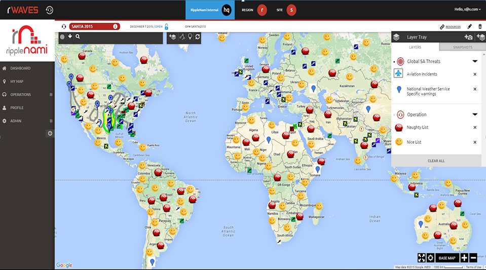
This holiday season, Santa Claus is using innovative technology to become even more efficient. He will be using RippleNami, a cloud-based visualization platform, to efficiently and safely deliver presents.
Our favorite jolly man is one busy fellow. Not only does he have to keep track of the naughty and nice kids all year long and make the appropriate number of toys and lumps of coal, he then has to visit the homes of children all over the world in a single night. There are many things Santa has to keep in mind as he’s planning his yearly trek across the globe — such as weather conditions, flight patterns of other aircraft, and which homes have chimneys. How does Santa possibly keep track of everything?
RippleNami, a cloud-based visualization platform, allows users such as Santa to access data from countless sources and customize information layers into an easy-to-use map. Below is a snapshot of the data Santa can integrate into the RippleNami platform to efficiently and safely deliver presents this year.
Weather Conditions — Poor weather conditions can significantly impact Santa’s route. Fog in particular has traditionally been a difficulty, even with the help of Rudolph’s nose. RippleNami allows Santa to track fog in real time, so he knows when Rudolph’s nose is necessary, and when the reindeer can take a break.
Aviation Incidents — Santa’s sleigh isn’t the only thing flying on Christmas Eve. Tracking flight patterns and visualizing where aviation incidents have recently occurred help Santa avoid collisions and plan the fastest route.
Naughty and Nice Lists — Santa is diligent in keeping track of which kids are naughty and which are nice. He makes a list, and checks it twice! But even Santa could use help planning how many toys versus lumps of coal he needs to pack in his sleigh before the big night. And what if a child who has been nice all year long suddenly throws a fit Christmas Eve? With RippleNami, Santa will be alerted in real time and can pick up some extra coal accordingly.
Here is a visual of what Santa sees when he’s using the platform.
Geospatial data is everywhere. Many times I’ve shown the following photo I shot at the Esri User Conference several years ago. At the Field Technology Conference in November, I talked about this. Actually, I believe I’ve talked about the topic at nearly every Field Technology Conference since the inaugural event in 2010. Geospatial data long ago left the user domain of thousands and is rapidly headed toward billions.
One of the many developments driving that growth was the appearance of Google Earth in 2004, sprung from Google’s acquisition of Keyhole. Suddenly there was easy-to-use software to visualize geospatial data. At about the same time, Navteq (now HERE) and TeleAtlas (now TomTom) — two of the premiere geospatial data companies at the time — were gaining tremendous momentum in the exploding GPS car navigation market because they were, and still are, the two companies that provide the vast majority of the map data to the Garmins and TomToms (and others) of the world.
Professional Mapping
Today, Google Earth and Google Maps are still the defacto standard for “desktop mapping” by the general consumer. Google Earth Pro, the company’s offering to the high-end mapping market, formerly available on a subscription basis, will soon be free, as of January 2016. Previously the user received the following, and one supposes the same will continue to hold true:
Advanced measurements: Polygon area measurement. Determine affected radius.
High-resolution printing: Print images up to 4800 x 3200 pixels.
Pro data layers: Demographics, parcels, traffic count.
Import spreadsheet data: Import up to 2,500 addresses at a time.
Import Esri and MapInfo-formatted data: Import .shp and .tab files.
Make HD movies: Make Windows Media and QuickTime HD movies.
Trimble offers another cool geospatial tool that was once part of the Google portfolio. SketchUp is a powerful software for creating 3D visualizations (think 3D structures and objects).
Building that was modeled in SketchUp and overlaid in Google Earth
Both free SketchUp and fee-based SketchUp Pro versions are available. If your work includes generating renderings for clients, the latter can be valuable. You can download a free trial version here.
SketchUp pro is designed for architects, engineers, and design and construction professionals, as well as members of the global maker community. Its capabilities include:
Professional Drafting: Using a 2D drawing and documentation tool, users can manage drawings and display data from their information models, applying object classifications and accessing that info with an annotation tool.
Modeling Tools: With a 3-point arc tool, users can draw arced edges four different ways. A rotated rectangle tool allows for drawing precise rectangles unbound by default axes.
3D Warehouse: Models of popular brand-name building products are among a broad free content offering, more than 2.5 million models.
Integrating with Other Geospatial Tools
In coordination with Google, Esri has prepared a transition offer to ArcGIS for Google Earth Enterprise and Google Maps Engine customers and partners. ArcGIS provides 2D and 3D mapping and analysis in desktop, server and hosted environments. The system provides an infrastructure for making maps and geographic information available throughout an organization, across a community and openly on the Web.
Among its features:
Geoprocessing: a 3D analyst incorporating a LAS dataset toolset and visibility toolset; and conversion, data management, multi-dimension and spatial analyst toolboxes.
Geodata: connections to read-only databases or geodatabases in Oracle.
Extensions: 3d analayst and spatial analyst extensions.
Esri will provide no-cost software to replace Google Earth Enterprise or Google Maps Engine technology, and will include no-cost training in ArcGIS.
Realizing the value and momentum of Google Earth to reach the consumer users of geospatial technology, Esri has also announced ArcGIS Earth, and its website says it is accepting beta testers.
At Play in the Fields of Google Earth Pro
For just a quick-and-dirty exercise, I imported some unsmoothed, 1-foot contour lines generated from a UAV flight and overlaid them in Google Earth Pro.
Planimetric view
Then, in true Google Earth fashion, I zoomed in to have an oblique ground view (with Mt. Hood in the background, some 74 kilometers in the distance).
Zoomed in oblique ground view
Finally, following is the UAV imagery overlaid in Google Earth Pro.
Screenshot of the UAV imagery overlaid in Google Earth Pro
Actually, the Google Earth Pro imagery looks pretty good, but you start to see the differences as you zoom in. It’s hard to beat UAV orthophoto resolution.
Google Earth imageryUAV imagery shot with a 12-megapixel camera at 200 feet AGL (above ground level.)
Last month, I wrote that I’d post the presentations from the Field Technology Conference. Well, they aren’t quite ready, so we’ll have them for next month. There’s a great mix of presentations on GPS/GNSS, mobile devices, UAVs for mapping, laser rangefinders, various sensors and GIS software.
Happy Holidays and cheers to a prosperous New Year!
This release of ArcGIS, planned for 2016, expands the existing native integration with SAP HANA and allows customers to run SAP Business Suite and ArcGIS applications within an architecture based on SAP HANA. The companies said they will further enhance the SAP HANA platform by more deeply integrating advanced ArcGIS geospatial capabilities and content across SAP’s broader application portfolio.
The collaboration between SAP and Esri is expected to provide the ability to run both GIS workloads and advanced spatial analytics on a single SAP HANA geodatabase. The companies stated that customers will be able to apply sophisticated business rules and relationships to spatial data directly in SAP HANA, define advanced georelational models such as topologies and networks, and permit both GIS and enterprise business users to work within the same multiuser access and editing environment.
“We’re very excited about the enterprise geodatabase support for SAP HANA,” said Jack Dangermond, Esri’s president. “It will bring our customers speed, simplicity and better integration with their enterprise information. For SAP customers, it delivers a complete platform for mapping and geospatial intelligence. By synchronizing our platforms, our respective customers will benefit across the enterprise. We’re doing the work to make sure that GIS and mapping is available to all — not just traditional mapping experts.”
SAP and Esri have been technology partners for a number of years, providing integration of their respective platforms, SAP HANA and Esri ArcGIS. Companies invested in Esri and SAP can immediately create maps populated with data from SAP HANA and instantly access those maps anywhere on any ArcGIS client, as well as in SAP or custom applications. Today users of SAP HANA can access ArcGIS for geospatial data and geoservices and perform analytics, while Esri users can similarly access, analyze and query both spatial and nonspatial data directly in SAP HANA. Esri supports deployments of SAP HANA with query layers and features services for customers that want to dramatically increase spatial query performance by running SAP HANA side by side with ArcGIS.
“Our customers represent a new generation of data stewards requiring an in-memory computing platform that performs at scales unseen before — including large-scale geography,” said Daniel Schneiss, senior vice president and global head, SAP HANA Platform and Databases, SAP. “As we enter a world of exponential data growth and the Internet of Things, the need to geospatially analyze Big Data will only increase from this point forward. We look forward to teaming with Esri to address this need by integrating the full power of ArcGIS technology with SAP HANA.”
“The geoDVR is a purpose-built geospatial DVR for the airborne utility and pipeline patrol industry and it shows” said Nathan Kayes, managing member of Due North Aviation. “Being able to record all three HD and SD video channels to a single drive, along with the Live Moving Maps and Waypoint Keyword modules, offers significant advantages both in the air and for the final inspection deliverables we provide our clients.”
The geoDVR Gen2 is an advanced mil-spec DVR for recording multiple channels of geo-referenced high-definition full motion video in airborne and mobile mapping environments. It is ideally suited for professional utility/pipeline inspection, electronic news gathering and airborne law enforcement applications that utilize multi-sensor gyro-stabilized gimbal video cameras, Remote Geo says.
The geoDVR monitor and interface with optional Live Moving Maps module were installed.
Due North Aviation will use the geoDVR with their SWESystem 300 gimbal to perform helicopter-based electric utility inspections with HD color, infrared and corona (UV) video. Using LineVision software, Due North will combine the geoDVR videos as well as high-resolution oblique still photos to create geoProjects for their clients.
Videos, photos, points of interest and audio notes collected with the geoDVR are compatible with Remote GeoSystems’ LineVision suite of GIS project mapping and reporting software. LineVision allows for simple desktop and browser-based playback, analysis and project reporting utilizing the Esri ArcGIS for Desktop, Server and Cloud platforms, as well as Bing Maps and PLS-CADD.
Hexagon AB has entered a strategic partnership with Huawei, an information and communications technology (ICT) company, to deliver smart city solutions.
With most of the world’s population living in cities, safety and infrastructure challenges are at an all-time high. Hexagon and Huawei are working together to meet this global challenge by integrating Huawei’s communications hardware with Hexagon’s safety and infrastructure software solutions.
The combined solution improves inter-agency collaboration and leverages big data analytics to better predict, prepare for, and respond to urban area challenges.
Safety is a primary focus of the combined solution, offering cities connected command centers with integrated systems that maximize efficiencies in all preparedness and response areas. Huawei’s contributions include technologies from its Safe City portfolio such as high-definition video surveillance, broadband trunking and IP-based conference calling systems. Hexagon’s emergency response, utilities management and transportation software solution portfolio, which includes computer-aided dispatch, will provide the visibility and decision-support backbone to enable customers to think and act more nimbly.
“Huawei’s technologies, expertise and global coverage, especially in emerging market areas, nicely complement our ability to deliver smart city solutions to law enforcement, government, security personnel and other public service agencies around the world,” said Ola Rollén, Hexagon president and CEO.
“Safety, including efficient response to crisis management, will continue to be a key challenge for urban management, especially in developing economies that are stimulating population movement into these areas,” said Yan Lida, president of Huawei Enterprise Business Group. “Together with Hexagon, the global authority on safety and infrastructure solutions, our extensive ICT technologies that help architect safe city infrastructure will help make societies safer.”
NM Group is nearing completion on an aerial mapping project covering more than 16,000 kilometers of United Kingdom rail network.
In 2014, NM Group was engaged to map the rail assets with a mix of high-tech laser measurement and imaging equipment, as part of a project to improve asset maintenance, operational effectiveness, efficiency and safety.
The project used a mix of specially commissioned lidar and high-resolution multi-angle cameras mounted on helicopters, carrying out aerial operations and ground-control activities over a four-month period and completing it before winter. The survey information was rapidly transported to NM Group’s Technology Centre in Knaresborough, North Yorkshire, where a team of specialists have been converting nearly a petabyte of raw data into a wide range of terrain, asset and imaging outputs.
“I am incredibly proud of the way our team has responded to this large and challenging project, completing the data capture within an unprecedented timescale and producing a high-quality output that will serve the rail network for years to come,” said NM Group’s CEO Kevin Jacobs.
NM Group’s contribution to the program provides the geospatial fabric on which other layers are overlaid, the basis for asset location mapping and the start point for the design of upgrades and modifications. Traditionally, this information would have been created by a visit to the site by a team of surveyors.
The new method will significantly reduce the need for future field work and trackside access. It will also facilitate more efficient maintenance, allowing crews to identify and access assets more safely and efficiently than in the past, via apps on a range of mobile devices, NM Group said.
NM Group is a specialist service provider of asset management, surveying and mapping solutions to sectors including energy transmission and distribution and road and rail transport. Applying a range of remote sensing and geospatial technologies, the company offers a full range of services from data acquisition through to analytics and web applications for wider access to information.