Status map showing the location and density of volunteer submitted structure edits.
This April marks the one year anniversary of the transition of the USGS’s The National Map Corps (TNMCorps) from a small regional pilot project in the heart of Denver, Colorado, into a successful nationwide project. During the past year, civilian volunteers in every state have increasingly provided accurate mapping data to the National Geospatial Program’s publicly available application called The National Map.
Using crowdsourcing techniques, TNMCorps’ Volunteered Geographic Information (VGI) project engages citizen scientists to collect man-made structures data including schools, hospitals, post offices, police stations and other important public buildings.
Over the past year TNMCorps has achieved the following significant milestones:
1,422 – volunteers
42,009 – contributions (counts each person’s edit per single point)
50,696 – total number of edits (the sum of all edits made by volunteers)
50 – number of states involved
18 – number of volunteers who have earned more than 500 points
4,691 – state with largest number of edited points; Colorado
“This project has proven that we can count on volunteers to provide quality information to be included in authoritative government databases,” said Kari Craun, director of the National Geospatial Technical Operations Center. “The people that have contributed their time are performing a community service by ensuring key structures data are available publicly.”
To volunteer, go to The National Map Corpsproject site. The project is seeking anyone with access to the Internet willing to dedicate some time editing map data. Participants can earn badges and public recognition by a series of points.
While some familiarity with the area that a volunteer chooses is helpful, volunteers don’t have to live near a particular place to contribute. The tools on TNMCorps website, along with ancillary information available on the Internet, are generally sufficient to edit a distant area.
During this year, National Atlas of the United States and The National Map will transition into a combined single source for geospatial and cartographic information. This transformation is projected to streamline access to maps, data and information from the USGS National Geospatial Program (NGP). The move will prioritize the the agency’s civilian mapping role and consolidate core investments, the agency said.
The USGS will continue its long history of providing topographic maps, geospatial data and other geographic information by offering a range of scales and layers of geospatial information on The National Map Viewer and through US Topo maps. As a result of the conversion to an integrated single source for geospatial and cartographic information, nationalatlas.gov will be removed from service on September 30, 2014.
“We recognize how important it is for citizens to have access to the cartographic and geographic information of our nation. We are committed to providing that access through nationalmap.gov,” said Mark DeMulder, NGP director.
“We value the National Atlas customers and stakeholders and want to make this transition as easy as possible,” explained Jay Donnelly, the National Atlas Program Manager. “We will post updates to The National Map and National Atlas Websites as this transition unfolds, including information on the future availability of the products and services currently delivered by nationalatlas.gov.”
Wind generates electricity by turning the blades of turbines. Individual turbines can range in height from several dozen to several hundred meters tall, with blade lengths measuring several dozen meters. Image credit: USGS
Wind energy is one of the fastest-growing sectors of renewable energy in the United States. About 3% of the total electricity in the United States was generated by wind turbines in 2012 (according to the U.S. Energy Information Administration), which is equivalent to the annual electricity use for about 12 million households. The amount of electricity generated by wind has increased from about 6 billion kilowatt hours (kwh) in 2000 to 140 billion kwh in 2012.
In response to the Department of Interior’s Powering Our Future initiative, the U.S. Geological Survey (USGS) has begun investigating how to assess the impacts of wind energy development on wildlife at a national scale.
Assessment Experience
The USGS has extensive experience assessing energy resources, and it’s that expertise that makes the USGS qualified to assess nationwide impacts of wind energy development. One of the major reasons behind the success of USGS energy resource assessments is the scientifically robust methodology that underpins them.
USGS energy resource assessment methodologies are publicly available and are technically peer reviewed externally, and just as importantly, are used consistently in every assessment. That means that a USGS oil and gas assessment in Alaska provides comparable information to a USGS oil and gas assessment in Texas, or that a USGS geothermal assessment in California is comparable to a USGS geothermal assessment in Nevada.
A Different Kind of Assessment
USGS has recently undertaken a project to develop a methodology for assessing wind energy impacts on wildlife at a national scale. This research is different from previous USGS energy assessments. Instead of looking at technically recoverable resources of oil, gas, geothermal or coal, or even technically accessible storage areas for carbon sequestration, the USGS is developing a method for determining the impacts of a type of energy production. This work will merge the experience the USGS has creating assessment methodologies with its expertise in wildlife ecology and wind-wildlife research, as well as in land change science.
Wind turbines are often grouped together in facilities to maximize electricity-generating capacity. This image shows a wind farm on BLM land in California. Image credit: BLM
Wind energy can impact both wildlife and their habitats. Wildlife impacts include potential bird and bat mortality from collisions with turbine blades, and in some cases, species avoidance of habitat near turbines. Habitat impacts include the turbine pads in addition to service roads, transmission lines, substations, meteorological towers, and other structures associated with wind energy siting, generation, and transmission.
Turbine Locations
The first step in understanding the impact of wind energy development is to determine where the wind turbines are located. Prior to this study, there was no publicly available national-level data set of wind turbines. There were maps that showed turbines locations in a few states, and there were national-level maps that showed wind power facilities, but not individual turbines, or information about those turbines, such as height, blade length, or energy producing capacity.
A screenshot of the USGS WindFarm Mapping Application, which allows users to access the more than 47,000 individual wind turbines contained within the national wind turbine database. This view shows facilities in Southern California, color-coded for their wind-generating capacity. The red and yellow turbines have a higher electricity-generating capacity than the green and blue turbines do.
To remedy the lack of information, the USGS created this publicly available national dataset and interactive mapping application of wind turbines. This dataset is built with publicly available data, as well as searching for and identifying individual wind turbines using satellite imagery. The locations of all wind turbines, including the publicly available datasets, were visually verified with high-resolution remote imagery to within plus or minus 10 meters.
Knowing the location of individual turbines, as well as information such as the make, model, height, area of the turbine blades, and capacity creates new opportunities for research, and important information for land and resource management. For example, turbine-level data will improve scientists’ ability to study wildlife collisions, the wakes causes by wind turbines, the interaction between wind turbines and ground based radar, and how wind energy facilities overlap with migratory flyways.
Next Steps
In addition to the value this powerful tool has to Federal and State land managers, non-governmental organizations, the energy industry, scientists, and the public, it will be a useful component in the methodology that the USGS is developing for assessing wind energy impacts. The USGS is bringing together scientists with expertise in landscape-level science, wildlife biology, and other associated disciplines to create the methodology. Once developed, the methodology will be externally peer-reviewed and tested with pilot-level data projects. Once peer reviewed, the revised methodology will be published for others to understand and use.
The U.S. Geological Survey (USGS), in cooperation with other federal agencies, has posted new Idaho U.S. Topo quadrangles (1,193) and New Mexico quads (1,980 maps), which include the Public Land Survey System (PLSS). These are added to the growing list of states west of the Mississippi River to have PLSS data added to U.S. Topo maps.
The PLSS is a way of subdividing and describing land in the United States. All lands in the public domain are subject to subdivision by this rectangular system of surveys, which is regulated by the U.S. Department of the Interior. Other selected states will begin getting PLSS map data during the next respective revision cycle.
The new design for U.S. Topo maps improves readability of maps for online and printed use, while retaining the look and feel of the traditional USGS topo map. Map symbols are easy to read when the digital aerial photograph layer imagery is turned on.
Santa Fe, New Mexico 2013 U.S. Topo quadrangle, showing PLSS data with contour, orthoimage and woodland layers off. Note: “US Topo maps are not legal documents. The PLSS information shown on these maps is for general reference purposes only, and should not be used to determine legal boundaries or land ownership. The Bureau of Land Management (BLM) is the authoritative source for PLSS information at the federal level, and the US Topo representation is derived from BLM GIS data files. The management of these data is not completely uniform throughout the country.
“It is a privilege to support production of the U.S. Topo maps, as I am an extensive user of these products,” said Kristin Fishburn, a geographer with the USGS. “The capability to turn layers on and off combined with the continuous enhancements in content makes the maps particularly useful for a recreational user. I’m excited to peruse the new Idaho and New Mexico maps.”
Other re-design enhancements and new features include:
New shaded relief layer for enhanced view of the terrain
Military installation boundaries, post offices and cemeteries
New road classification
A slight screening (transparency) has been applied to some features to enhance visibility of multiple competing layers
New PDF legend attachment
Metadata formatted to support multiple browsers
U.S. Topo maps are created from geographic datasets in The National Map, and deliver visible content such as high-resolution aerial photography, which was not available on older paper-based topographic maps. The new maps provide modern technical advantages that support wider and faster public distribution and on-screen geographic analysis tools for users.
The digital topographic maps are PDF documents with geospatial extensions (GeoPDF) image software format and may be viewed using Adobe Reader, available as a no-cost download.
These new quads replace the first-edition U.S. Topo maps for Idaho and New Mexico. The replaced maps will be added to the USGS Historical Topographic Map Collection, which are also available for free download from The National Map and the USGS Map Locator & Downloader website.
US Topo maps are updated every three years. The initial round of the 48 conterminous state coverage was completed in September of 2012. Hawaii and Puerto Rico maps have recently been added. More than 400 new US Topo maps for Alaska have been added to the USGS Map Locator & Downloader, but will take several years to complete.
Ten years ago, scientists watching the skies experienced a Halloween fright of cosmic proportions, when space weather degraded GPS signals, affecting land and ocean surveys, and commercial and military aircraft navigation.
The most extreme of what became known as the Halloween Storms hit on October 30, 2003 — ten years ago today. According to the National Oceanic and Atmospheric Agency, the Earth could experience a repeat performance this Halloween, with a 35 percent chance of a major storm at high latitudes.
In mid-October 2003, a bundle of concentrated magnetic energy emerged from the Sun’s interior, forming a large sunspot, a site of seething activity. Enormous solar flares soon followed.
Then, on October 28, the sunspot abruptly ejected a concentrated mass of electrically conducting solar wind, flinging it out into interplanetary space toward the Earth. Less than a day later, on October 29, a geomagnetic storm was initiated as the solar wind disrupted the Earth’s protective magnetosphere.
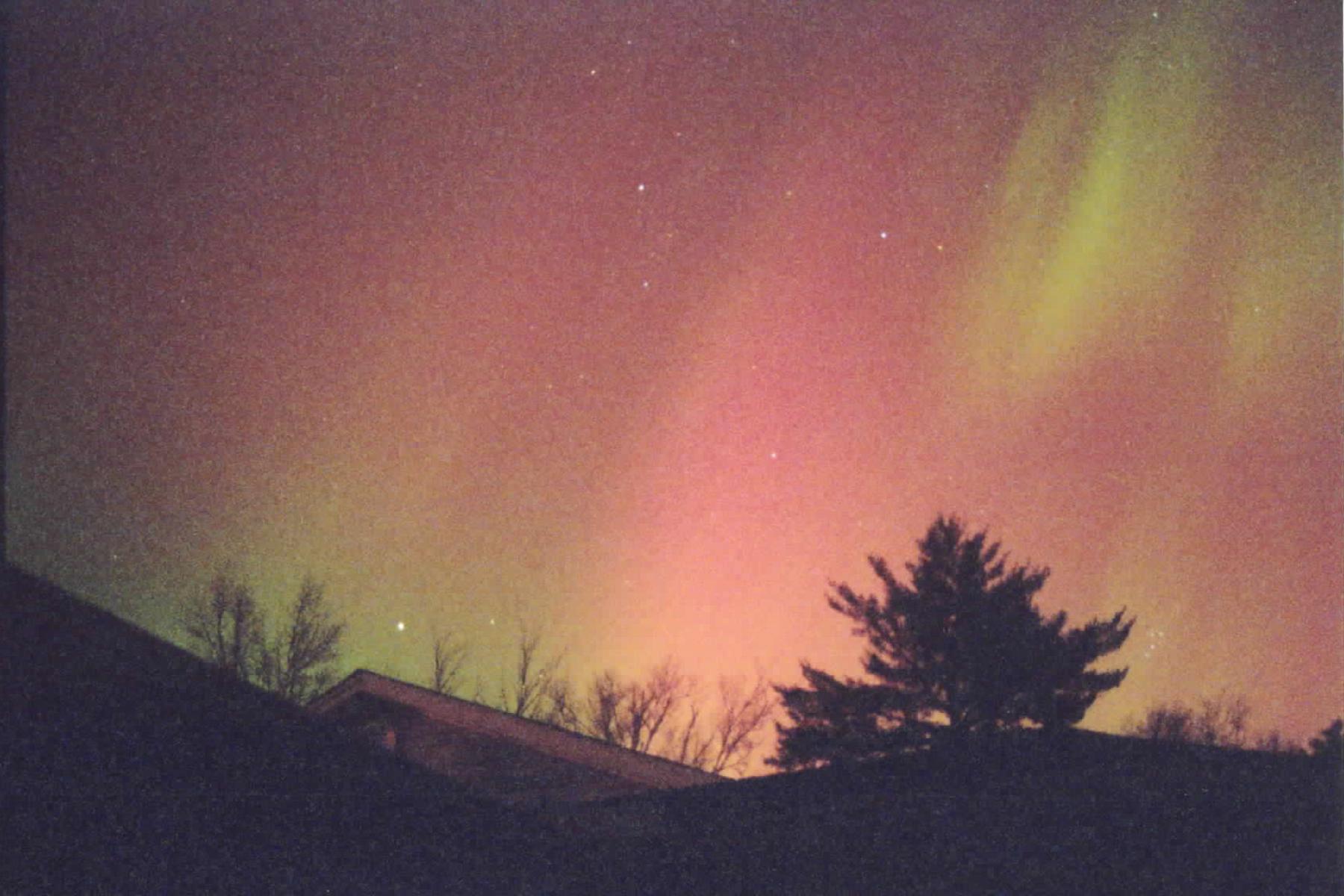
Over the next three days, the “Halloween magnetic storm” would evolve and grow to become one of the largest such storms in half a century. Magnetic storms are global phenomena, and their effects can be easily seen around the world. During the Halloween storm, for example, magnetic direction in Alaska quickly changed by more than 20 degrees. In other words, the storm was so large that it could be measured with a simple compass. The Halloween magnetic storm also produced spectacular aurora, with green phantom “northern lights” seen as far south as Texas and Florida.
“The aurora was exciting,” said Richard Langley, GPS World’s Innovation editor. “I’ve never seen a better one since.”
This full-sky aurora was observed near Fredericton, New Brunswick, Canada (46 degrees north latitude) on October 30, 2003. (Photo courtesy of Richard Langley.)
Langley explained the effect of the phenomenon in his introduction to the October 2004 Innovation article, “Combating the Perfect Storm: Improving Marine Differential GPS Accuracy with a Wide-Area Network.”
It was previously thought that the mid-latitude North American ionosphere was reasonably benign, with minimal storm effects of relevance for marine DGPS users. However, during ionospheric storms in May and October, 2003, [single-frequency] marine DGPS horizontal position accuracies were degraded by factors of 10–30.These degraded accuracies persisted for hours and were well beyond system tolerances specified for marine DGPS users. Such ionospheric activity is not unusual during the years following solar maximum, and is expected to persist for several years.
Langley provides background on what scientists learned from the Halloween Storms in his February 2011 Innovation column, “GNSS and the Ionosphere: What’s in Store for the Next Solar Maximum?”:
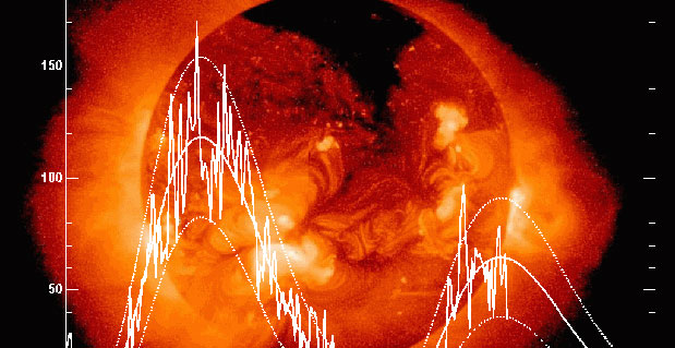
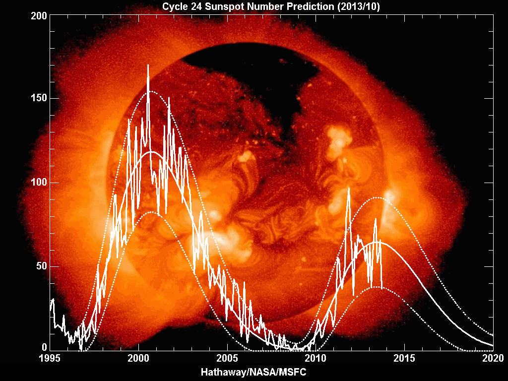
The current solar cycle is referred to as cycle 24. During the last solar cycle, cycle 23, the GNSS community was alert and aware of what could happen, and therefore many events were observed and analyzed. Among the most well-known events is a sequence of storms during October and November 2003, commonly referred to as the Halloween Storms.
The most extreme was the storm on October 30, 2003, which resulted from a CME on October 29 at 20:49 UTC, which subsequently impacted Earth’s magnetic field at 16:20 UTC on October 30 and produced a great geomagnetic storm, which lasted for many hours.
Effects on GPS positioning of this storm have been documented by the GNSS research group of the Royal Observatory of Belgium, where kinematic analyses of data from 36 GNSS stations in Europe showed position errors of more than 10 centimeters in the horizontal and up to 26 centimeters in the vertical between 21:00 and 22:00 UTC on October 30. The position errors were largest for locations in northern Europe including Sweden and Norway. The data analysis was carried out using high-quality carrier-phase data, and the processing was based on using an ionosphere-free linear combination of observations from the L1 and L2 frequencies, whereby the first-order effect of the ionosphere is removed from the results. The position errors are thus caused by mainly higher order ionospheric effects.
For navigation-grade GPS positioning, a U.S. National Atmospheric and Oceanic Administration technical memorandum reported that the Wide Area Augmentation System (WAAS) vertical error limit of 50 meters was exceeded for a period of about 11 hours on October 30, 2003. This means that, in practice, WAAS was not available for precision aircraft approaches during that time. The European Geostationary Navigation Overlay Service (EGNOS) was not transmitting during the storm, but simulations carried out later by ESA showed that the boundary regions of the EGNOS coverage area would have been especially affected by a reduction in service availability of about 20–60 percent during that day.
The simulations also showed, however, that in the center of the EGNOS coverage area (in the vicinity of northern Italy), the effect would have been much smaller with a reduction in service availability of only 5–6 percent over the day.
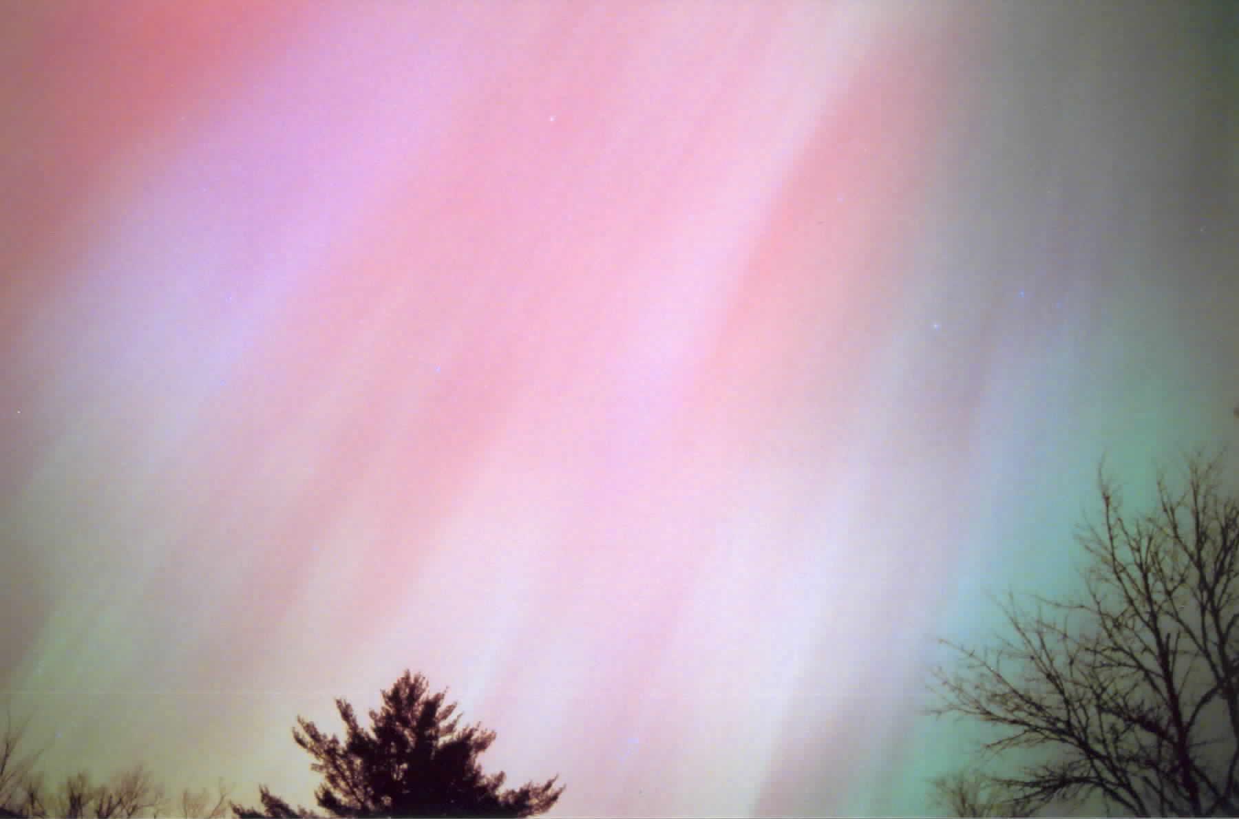
Such large storms are also often accompanied by displays of aurora (aurora borealis and aurora australis) at lower latitudes than normal.
Another shot of the Halloween 2003 aurora, as seen near Fredericton, New Brunswick. (Photo courtesy of Richard Langley)
Other Innovation columns assessing the ionosphere’s effect on GPS include:
“In an ever-changing environment, it would be ideal if the U.S Geological Survey had a presence in every corner of the nation. While we may not be able to cover every inch of the landscape, we can greatly enhance our scope with your help,” the USGS continues.
The USGS has a variety of citizen science efforts where people can report what’s happening in their own backyards. It’s seeking information on events such as earthquakes, landslides, new construction, and climate. “If you live in Alaska, we want you to tell us if you experience a volcanic ash fall and even collect a sample,” the USGS said.
The information gets aggregated and disseminated through a variety of tools geared toward making this information easily accessible so it can be put to use. Using , there are interactive online systems where people can report what it was like during an earthquake, and then see all the reports for that event mapped out for the affected area.
“Through your contribution, not only will your observations build a much larger and more complete database, but you will also become a virtual member of the USGS scientific team!” the USGS said.
Map of tweets containing the word “terremoto” (Italian for “earthquake”) collected in the two minutes following a magnitude 6.0 earthquake in Northern Italy on May 5, 2012. The red star shows the location of the earthquake. The tweets are concentrated in the epicentral area but discussion of the earthquake has already spread beyond the impacted region. This shows the speed that USGS Tweet Earthquake Dispatch (TED) collects tweets to provide insight into potential earthquake events. Image Credit: USGS.
The valuable role of crowd-sourcing data is outlined in a 2013 report by the Woodrow Wilson International Center for Scholars, authored in collaboration with the USGS. The report highlights success stories from the USGS’ Tweet Earthquake Dispatch (@USGSted) program, Did You Feel It? and related USGS activities. For example, although there was an exceedingly swift international aid response to the massive 2008 earthquake in Wenchuan, China, the first reports of the event outside of the impacted area came from citizens, and information spread through the use of social networking tools such as Twitter. Similarly, 148,000 individuals used Did You Feel It? to describe their experience of a magnitude 5.8 earthquake that occurred in Virginia on August 23, 2011. Because large-magnitude earthquakes are fairly rare along the East Coast, there were only a handful of seismometers installed nearby to record the event. Thus, much of the preliminary data regarding this earthquake came from the DYFI? system.
These are the ways USGS gathers information from the public:
Improving Earthquake Monitoring
Did You Feel It? (DYFI?) is an online crowd-sourcing system developed by the USGS for the public to provide first-hand accounts of earthquakes they experience. As one of the longest standing and most successful examples of citizen-based science to date, it has garnered more than 2,790,000 total responses since its launch in 1997.
Through this program, users are able to document the shaking level they experienced and find out what was felt elsewhere. Specifically, USGS scientists aggregate results by zip code (domestically) and by city (globally) to show reported shaking intensity. Those reports also augment shaking data from sensors and are incorporated in ShakeMaps used for emergency response. To document a seismic encounter, visit the DYFI? home page and fill out a brief questionnaire.
Tweeting and Shaking
Many regions around the world have only a scant number of seismometers, complicating the rapid detection and characterization of earthquakes. To enhance earthquake monitoring, Twitter has proven to be an advantageous source for USGS scientists to receive rapid firsthand accounts of potential events.
The USGS Tweet Earthquake Dispatch (TED) program rapidly detects possible earthquakes when a large number of public tweets mention “earthquake” or its equivalent in several languages. These tweet-based detections often come prior to sensor alerts in sparsely instrumented regions. USGS analysts at the National Earthquake Information Center (NEIC) receive these indicators and then turn to more accurate earthquake sensors and instrumental data for confirmation and quantitative assessment. For earthquakes with a magnitude 5.5 or greater, the USGS sends out notifications via the Twitter account @USGSted to people around the world.
Did You See It? Watch Out for Landslides
In an average year, landslides can cost the United States up to $2 billion in damage. Now, scientists at the USGS are asking the public to help track landslides to better understand how to protect lives and property. This is being done through the system, Did You Feel It? This program allows respondents to report detailed accounts of observed landslides, including photographs. To make your contribution, visit the DYSI? webpage and click on the Report a Landslide tab.
Ascending eruption cloud from Redoubt Volcano as viewed to the west from the Kenai Peninsula. Photo Credit: R.J. Clucas, USGS.
Is Ash Falling? Helping Monitor Volcanic Eruptions
This tool will help AVO scientists build a more complete record of the amount, duration, and extent of ash fall. Getting first-hand accounts of ash fall will also help refine computer models of ash cloud movement and interpretation of satellite imagery. Citizens are also encouraged to collect ash samples and send them to AVO. With your help, volcano scientists can greatly expand their sampling of ash deposits.
The National Map Corps
Citizen volunteers are also making significant additions to The National Map (TNM), a web-based geospatial visualization platform. The public is encouraged to collect data on manmade structures such as schools, hospitals, post offices, police stations, and other buildings. The project started in 2012 in Colorado and has expanded to 35 states. A recognition program has also been created where badges can be earned based on the number of data points a volunteer contributes. This effort is through The National Map Corps (TNMCorps) Volunteered Geographic Information project, which partners with organizations such as 4-H and GISCorps.
Observing Nature’s Calendar
As the seasons come and go, temperatures fluctuate, leaves emerge and change colors, and animals migrate. The USA National Phenology Network gives you this opportunity through its program Nature’s Notebook. Volunteers are collecting observations of these seasonal changes—referred to as phenology—to help scientists better understand subjects including climate change, invasive species, agricultural production, impacts of frosts and freezes, and the timing of pests and diseases.
The United States Geological Survey (USGS) announced that in light of swiftly changing technical landscapes and increasing uses of social networking, the USGS is exploring a new approach to the volunteer program, and is launching a project to test options for volunteer participation in providing data to The National Map.
The project involves mapping man-made structures and facilities, such as schools and fire stations, in the state of Colorado. Using an internet mapping application, volunteers can help the USGS update The National Map by correcting or adding information about structures.
“Even members of the public who can’t tell a sandstone from a rhyolite but have internet access can now help the USGS keep its popular maps up to date through our new experiment in crowd sourcing,” said USGS Director Marcia McNutt. “Correctly locating and identifying fire stations, police stations, schools, and hospitals not only makes USGS maps more useful, but can literally save a life.”
Over the past two decades, the USGS National Geospatial Program sponsored various forms of volunteer map data collection projects. Volunteers helped the USGS improve its maps during this period, by annotating paper maps, collecting data using GPS units, and submitting data using a web-based tool. However, in 2008, the volunteer mapping program was suspended as new methods for using volunteer data were being studied.
In recent years, new web- and mobile-based technologies have made it easier to create, combine, and share maps. Recent events have shown how well these technologies support the rapid and relevant production of geographic information.
If the Colorado pilot project is successful in attracting volunteers and capturing data for use in The National Map, the program may be expanded to other areas in the future.
This project offers volunteers an opportunity to participate in providing data to The National Map and US Topo map products. For more information, interested Colorado volunteers can visit the National Map Corps website.