Fairweather crew lower a launch into Puget Sound, Washington, for Hydrographic Systems Readiness Review testing. (Photo: NOAA)
U.S. researchers have completed the first high-resolution, comprehensive mapping of one of the fastest moving underwater tectonic faults in the world, located in southeastern Alaska.
The mapping information will help communities in coastal Alaska and Canada better understand and prepare for the risks from earthquakes and tsunamis that can occur when faults suddenly move.
Since 2015, scientists have been gathering data on the Queen Charlotte-Fairweather fault system, a 746-mile long strike-slip fault line that extends from offshore of Vancouver Island, Canada, to the Fairweather Range of southeast Alaska.
Team members are from the National Oceanic and Atmospheric Administration (NOAA), the U.S. Geological Survey (USGS) and their partners.
The most recent survey came from NOAA ship Fairweather, with USGS scientists aboard from April through July, when it collected multi-beam bathymetric data in an area along the U.S. and Canadian international border in water depths ranging from 500 to more than 7,000 feet deep.
Researchers aboard NOAA Ship Fairweather collected multibeam bathymetric data in an area along the U.S. and Canadian international border in water depths ranging from 500 to more than 7,000 feet deep from April through July. (Image: USGS)
“Providing scientific information to help protect vulnerable communities is one of our most important missions,” said W. Russell Callender, assistant NOAA administrator for the National Ocean Service. “Working with USGS and our state and academic partners, allows us to speed the development of information that can help communities better anticipate and prepare for risks from tsunamis and earthquakes.
“This project has been a great collaboration on an important scientific issue with significant implications for public safety,” said David Applegate, USGS associate director for natural hazards. “We will apply what we learn from this mapping mission to hazard assessments for Alaska’s coastal communities. Partnering with NOAA reflects the importance of addressing earthquake and associated tsunami hazards to both our missions, and it enables the USGS to bring our geologic expertise to bear on offshore fault structures that have significant onshore implications.”
Fault line activity poses a hazard to the growing populations of Juneau, Sitka and other communities throughout southeastern Alaska, as well as more than a million annual tourists and the seafloor infrastructure critical for Alaska’s communications and offshore energy industries.
With a slip rate of more than 2 inches per year, this fault may be one of the fastest-moving strike-slip faults in the world. (For comparison, the San Andreas fault in central California slips about an inch to an inch-and-a-half each year.)
Movement between the tectonic plates at the fault line has generated six earthquakes of magnitude 7 or greater within the last century. One of those earthquakes, a magnitude 7.8 earthquake near Lituya Bay, Alaska, in 1958 triggered a landslide that sent water 1,720 feet up an adjacent mountainside, one of the highest recorded run-ups of a tsunami — a rapidly rising turbulent surge of water often choked with debris.
A NOAA survey ship uses its multibeam echo sounder to conduct hydrographic surveys. (Image: NOAA)
A series of large-magnitude earthquakes and associated aftershocks in 2012 and 2013 spurred research cruises in 2015, in the first systematic effort to study the offshore Queen Charlotte-Fairweather fault system in U.S. territory in more than three decades.
A similar effort led by the Geological Survey of Canada has been underway along the portion of the fault located in Canadian territory.
The 2018 Fairweather survey built on five previous USGS-led marine geophysical and geological surveys between 2015 and 2017 in southeastern Alaska aboard a number of research vessels, as well as two cruises led by researchers from the Geological Survey of Canada, Sitka Sound Science Center and USGS.
During these surveys, researchers used an array of instruments to collect data on seafloor depth and texture, to profile sedimentary layers beneath the seafloor, and to derive sediment ages.
NOAA Ship Fairweather underway in Alaska. (Photo: NOAA)
NOAA nautical charts will be updated with the Queen Charlotte Fault data within a year once the data goes through a standard quality control process — although the fault area is too deep for any obstructions to pose a threat to marine traffic.
This research is part of a larger two-year effort between the NOAA Integrated Coastal and Ocean Mapping Program and USGS to map large portions of the Cascadia continental margin in federal waters offshore of Alaska, California, Oregon and Washington.
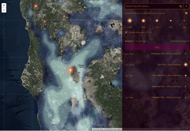
An Esri Storymap provides a quick snapshot of the raging fires across the United States and provides context to the severity of the California fires.
The interactive map can be explored by panning and zooming. Click on a fire and information about that particular fire is displayed including the start date, containment and links to the latest news and social information.
Esri Story Maps let users combine authoritative maps with text, images and multimedia content. It harnesses the power of maps and geography to tell a story in an easy and understandable format, the company said.
The Story Map uses the ArcGIS Javascript API and is linked to interactive timelines and magnitude displays. The cartography uses AGOL Firefly symbology — radial gradients — and a dark basemap.
The fires and perimeters are a service of the GeoMAC community that uses the Geospatial Multi-Agency Coordination, an internet-based mapping application that is designed for fire managers to access online maps of current fire locations and perimeters in the United States.
Members of GeoMAC include:
U.S. Geological Survey
National Interagency Fire Center
National Weather Service
Bureau of Land Management
Remote Sensing Application Center
National Geophysical Data Center.
The data is updated manually based on information from a host of sources including those on the ground. Typically, the data is fresh to about 24 hours, but there is variability because it is a carefully curated process.
Diving deeper for information
Esri has updated the app based on feedback from many different groups including firefighting professionals, those directly affected by fires, and those concerned about loved ones affected by fires. Some of the updates include the addition of the National Weather Service (NWS) animated smoke risk forecast, visualized to more directly represent smoke (see below).
The NWS animated smoke risk forecast is now integrated into Esri’s Story Map app. (Screenshot: Esri)
Another is the addition at finer scales of satellite-detected hot spots to indicate fire direction — sensors. Many Earth-observing satellites contain sensors capable of detecting the infrared energy released by fires. Not only can the hotspots be located, but areas of burned land can also be identified based both on their thermal characteristics and visible appearance. In Esri’s ArcGIS Living Atlas of the World, the MODIS Thermal Activity layer provides daily updated global hotspot locations.
In the U.S., the USA Wildfire Activity layer in the Living Atlas provides a more quality controlled version of the data. It shows only wildfires submitted to the USGS by fire agencies, as opposed to all of the other events that can cause an automated satellite-based hotspot detection. However, since this layer relies on human analysis, sometimes it doesn’t update as frequently as the MODIS hotspots. The layer also contains the perimeter of the fire area. Both current (active) and older (inactive) fires are included.
While the weather-focused satellites from NOAA and NASA provide high temporal resolution fire data, really detailed analysis of the fire impact is often left to moderate resolution multispectral imaging satellites such as Landsat 8 and Sentinel-2, or commercial high-resolution satellites. That is the benefit of the multispectral capabilities of the Sentinel-2 satellite, now available in the Living Atlas. Sentinel-2’s infrared sensitivity (Channel 12; 2.19 micron band) provides the ability to identify areas of active fires, much like NOAA-20 or Aqua/Terra, but at 20m resolution.
In addition to visualizing active fire areas, multispectral imagery is also effective at assessing burn scars. Besides the ecosystem impact, denuded vegetation along sloped areas can lead to landslides, especially when combined with heavy rains.
Looking southwest towards Leilani Estates with Fissure 8 erupting in the background. (Image: Ron Chapple/GEO 1)
High-resolution lidar surveys help first responders, scientists and government agencies monitor Kilauea conditions and predict future lava flows.
Independent geospatial data firm Quantum Spatial Inc. (QSI) has conducted high-resolution lidar surveys of areas surrounding the Kilauea volcano eruption in Hawaii.
The emergency response effort was part of the U.S. Geological Survey’s (USGS) Rapid Response Imagery Products (RRIP) in support of the Kilauea’s 2018 East Rift Zone – Remote Sensing Acquisition Requirement.
The USGS Hawaiian Volcano Observatory (HVO), along with emergency responders, government agencies and academics, will use the data to better understand the conditions and characteristics of the Kilauea volcano, which has been continually erupting since May 3.
Data also will assist planners in modeling potential lava flows, which may better predict and respond to future flows and enhance safety of residents.
The USGS National Geospatial Program (NGP) selected QSI to perform the first of two planned surveys over the active volcanic area. The QSI team, which included GEO1 and Windward Aviation, deployed within days to acquire high-resolution lidar at point densities averaging from 40 to 80 ppsm, with up to 150 ppsm in select areas and 100-mp digital imagery using a Riegl dual VUX-1 LR sensor pod equipped with ABGPS/IMU mounted on a Hughes 500D helicopter.
Five distinct locations, covering an area of 57 square miles, were targeted:
Kīlauea Summit Caldera
Pu’u O’o Crater and flow
Chain of Craters Road / Kaoe
Puna Geothermal Venture (PGV)
Western Leilani Estates lava field.
The project required 11 missions over the course of six days, operating at times as low as 500 feet above the ground and above active flows and nearby erupting calderas. With a need for a quick turn around, QSI deployed an analyst with the flight crew to post process each mission within hours of collection.
The data was uploaded to the Geospatial Repository and Data Management System (GRiD) interface, developed by the U.S. Army Corps of Engineers (USACE), where additional data products have been developed and provided to the response team that includes FEMA, Hawaii’s Emergency Operations Center (EOC) and the Hawaii County Civil Defense.
After data collection, QSI measured topographic shifts during the processing by comparing new data with a 2011 lidar collection from the same area. Survey specialists and USGS experts confirmed within hours of processing QSI’s lidar data that areas within the site had shifted up to 1.5 meters east, 2 meters to the north and 1 meter in elevation.
USGS scientists will continue to examine the new topographic data to better understand the nature of these shifts, and integrate it into lava flow models for more accurate predictive modeling.
“Airborne lidar and imagery remote sensing surveys are invaluable tools for understanding the effects of active volcanic eruptions, which change the topography as fissures emerge and lava flows extend to the ocean,” said Michael Shillenn, vice president at QSI. “We were honored to work with the USGS and others on this critical project. We believe that data and analysis provided by the QSI team will provide insights into future scenarios, enabling emergency responders to protect the surrounding community.”
Esri has published its latest book, “GIS for Surface Water: Using the National Hydrography Dataset,” by Jeff Simley, which details how to use geographic information system (GIS) technology to visualize and analyze data sets. Simley is an award-winning cartographer and the former lead of the Hydrography Program at the United States Geological Survey (USGS).
The book examines the complexities of surface water systems and shows readers how to use the Esri ArcGIS software, the USGS’s National Hydrography Dataset (NHD) and the Watershed Boundary Dataset (WBD), and the U.S. Environmental Protection Agency’s NHDPlus dataset to better study and manage the United States’ vast water system.
According to Esri, the book thoroughly examines the representation of water features and their attributes in a GIS and then turns its attention on how that data is structured in the NHD, WBD and NHDPlus datasets. In addition, after seeing how surface water hydrography can be modeled in a GIS, readers can then learn how to use these tools to solve real-world problems, such as protecting and restoring the fisheries habitat in Washington.
The book also offers instructions to guide readers to create surface water flow-volume maps that show how much water flows through any given river system.
“This book is unique in that it is the most comprehensive, authoritative source for the NHD,” said hydrologist David Maidment in the book’s foreword. “But it is more than that: It is a monument to the intellectual craft and dedicated effort of a generation of digital mapmakers who devoted their professional careers to the completion of this enormous task.”
The U.S. Geological Survey (USGS) has selected Dewberry, a privately held professional services firm, to collect and process Quality Level 1 topographic lidar data of Puerto Rico, including the islands of Culebra, Vieques and Isla de Mona; and the U.S. Virgin Islands of St. Croix, St. John and St. Thomas.
The new data will be used to identify the impact of Category 5 Hurricane Maria, which struck the territories in September 2017.
Digital elevation model of El Yunque National Forest produced from 2016 topographic lidar data. (Image: Dewberry)
The project will be completed under Dewberry’s Geospatial Product and Services Contract with USGS to support the agency’s 3D Elevation Program.
Dewberry has been performing mapping, mitigation planning and sea-level rise studies in Puerto Rico for more than 10 years, primarily serving the Federal Emergency Management Agency (FEMA).
In a similar effort, the firm recently collected and processed more than 3,400 square miles of topographic and bathymetric lidar data for USGS, the National Oceanic and Atmospheric Administration and the Commonwealth of Puerto Rico.
For that project, the data were collected prior to Hurricane Maria’s landfall, and the new data will be assessed in comparison to that dataset to evaluate the storm’s impact. Lidar data have not been collected for the U.S. Virgin Islands in more than 10 years.
Digital Elevation Model of the Guajataca Lake Dam produced from 2016 topographic lidar data. (Image: Dewberry)
The new lidar data will be collected, processed and delivered by the spring of 2019. Dewberry will perform all ground surveys and its geospatial team will complete the processing and creation of digital elevation models and other ancillary products. The firm’s subconsultant, Leading Edge Geomatics, will perform the data acquisition using two Riegl VQ1560i sensors.
“The pre-storm data we had collected and processed under our prior task order was instrumental in assisting FEMA, its partners and the local Puerto Rican government in planning and conducting its post-Maria disaster recovery work,” said Amar Nayegandhi, CP, CMS, GISP, vice president of geospatial and technology services for Dewberry. “The new data are being collected at a higher density to also support the infrastructure community and will show how the storm has altered the terrain.”
GPS measurements are playing a key role in monitoring the erupting Kilauea volcano in Hawaii.
The floor of the Pu’u ‘O’o Crater started to collapse on April 30, following weeks of uplift and increasing lava levels within the cone and seismicity in the East Rift Zone. The eruptions began on May 3, when a magnitude 5 earthquake struck, causing further collapse of the crater.
The Hawaiian Volcano Observatory (HVO) has monitored volcanic activity on the islands since 1912. The HVO is operated by the U.S. Geological Survey (USGS) and is issuing continuous updates on Kilauea.
The HVO is closely monitoring the biggest fissures in what is known as the lower East Rift Zone. Geologists are onsite to track ongoing and new fissure activity and the advance of lava flows.
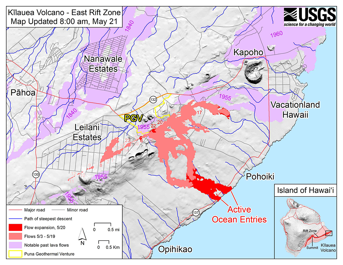
Kilauea eruption map as of 8 a.m. HST, May 21. Shaded purple areas indicate lava flows erupted in 1840, 1955, 1960 and 2014–2015. (Photo: USGS)
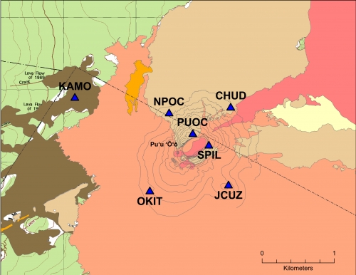
GPS stations monitor land movement of Kilauea. The Big Island’s most active volcano has erupted nearly continuously for more than three decades.
“Magma supplied to the Lower East Rift Zone was indicated by the northwest displacement of a GPS monitoring station,” the HVO said in its May 26 status update, but the station ceased movement a few hours later, telling a new story.
“Magma continues to be supplied to the Lower East Rift Zone; however, a GPS instrument near the Lower East Rift Zone is no longer moving, suggesting that the rift zone is no longer inflating in this area,” the HVO stated. “Elevated earthquake activity continues, but earthquake locations have not moved farther downrift in the past couple of days.”
Map of GPS stations installed near the Pu’u O’o vent on Kilauea. (Photo: USGS)
The GPS stations also monitor earthquake activity associated with the volcano. For instance, the May 4 magnitude 6.9 earthquake resulted in seaward motion of 1.5 feet along portions of Kīlauea’s south flank as measured by GPS stations across the volcano.
“Because active volcanoes make for unstable land, highly sensitive seismometers come in handy to track the frequency and strength of micro-earthquakes,” the HVO explained. “Global Positioning System (GPS) devices and another satellite-based technology, InSAR (Interferometric Synthetic Aperture Radar), map ground deformation (inflation and deflation) to within a fraction of an inch while tiltmeters measure slope from ground level. Together, these technologies help track lava’s movement underground and help pinpoint where it might break through the surface.”
While not as glamorous as mild-mannered Clark Kent holding down a day job while Superman comes to the rescue in time of crisis, there are professional surveyors who work day jobs to perform our duties as practitioners to make a living and participate in association activities in their off-hours to help promote and protect their profession as well as the public they serve.
Many of the hours spent to protect the profession are in the political arena, where the battle for budget dollars and service rights are fought on nearly a daily basis. Because of the reliance of the surveyor on technological advances, the profession has been thrust into the political arena at all legislative levels. The surveyor has been tasked with leading the discussion and help the public understand why significant dollars are needed for funding many different programs to continue with our high-tech trends and lifestyles.
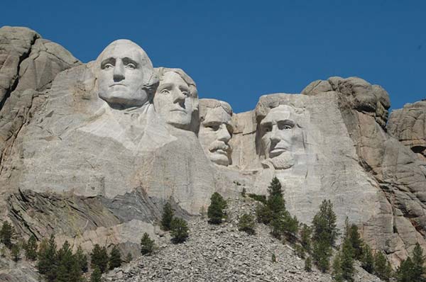
Three of the four presidents on Mount Rushmore started as surveyors — George Washington, Thomas Jefferson and Abraham Lincoln. (Photo: National Park Service)
The role of the surveyor has not been considered political even though several significant U.S. presidents were surveyors in their early careers. Surveyors aren’t particularly known for their public personas, much less their political prowess. Other than states that still have county surveyors, rarely do practitioners stray beyond local municipal government. One is more likely to see a professional engineer or architect as an elected official than a surveyor, but that doesn’t mean the issues we face are any less important.
My current position is a professional land surveyor with a full-time job overseeing a department in a multi-discipline office in a major metropolitan area. Besides being a contributing editor to GPS World through these articles, I also voluntarily wear many hats within our state association and the national surveying society. Several of these hats are government affairs positions at both state and federal levels, as it has become a full-time operation to keep a watchful eye at all governmental levels. From changes in regulations, budgetary revisions and threats to our professionl by outside entities, government affairs take a small army of people to keep abreast of all situations.
This month’s submission is just a snapshot of the current National Society of Professional Surveyors (NSPS) Joint Government Affairs Committee action item list being addressed and monitored through its committee members and a governmental lobbyist. The importance of this list is to give the reader a sampling of the seemingly endless battles being waged on Capitol Hill by NSPS and its members nationwide.
All these issues have GNSS at their heart and will have dire consequences if any of these subjects fall short of their intended marks.
This is not just about the GNSS and how we collect data; it’s also about the necessity of large scale data collection to provide better and safer services to the citizens of the United States and its territories.
Our current datasets and standards for data collection, like our infrastructure, is aging and lacking in detail. Serious upgrades are overdue, so several actions have been put forth to try to rectify the shortcomings.
3DEP
Formally known as the 3D Elevation Program, this language was introduced as part of S. 1460 (“Energy and Natural Resources Act of 2017”) by Senator Lisa Murkowski of Alaska. This program is being created so that consistent elevation data, cultivated through many surveying and mapping sources including lidar, will be available for efficient design use throughout the American infrastructure.
While it currently does not have a single line item in any budget, the USGS Budget Summary lists its necessity in the Core Science Systems Program as part of the National Geospatial Program. This program is intended to provide high-quality topographic, geologic and hydrographic data nationwide to assist with further development of energy, transportation, drainage, emergency response and hazard mitigation.
As part of the 2019 President’s Budget, the USGS Green Book also lists having the entire nation covered by an ongoing lidar program by 2033, along with completing a significant amount of data collection by various means in Alaska by 2022, including high-resolution interferometric synthetic aperture radar (IfSAR) necessary for data collection in more difficult terrain.
The Green Book also lists high-resolution hydrographic data to support flood risk management studies, as the frequency of large scale flooding seems to be increasing substantially in more places than ever before. It also includes additional mapping data, programming and functionality for emergency personnel charged with oversight of public safety in times of crisis.
FAA reauthorization
The current FAA authorization bill expires on March 31. The biggest hang up holding up getting the bill reauthorized is privatization of the air traffic controllers, but there are rumors of tightening of UAV rules due to the rapidly growing use of the vehicles for business and personal use.
Surveyors are working with federal and state officials to help implement reasonable rules for use and coverage of the UAV as the field of surveying has been drastically affected by use of aerial vehicles. Many tasks that used to take days now take hours with increase accuracy, so the effects of the UAV will be seen for many years to come.
Digital Coast Act
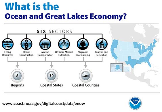
One of the legislative acts that NSPS was a big part of in 2017 was Senate Bill 110, “The Digital Coast Act” which led to the introduction of the companion bill in the House as H.R. 4062. This Act will allow NOAA to perform the necessary actions to actively and effectively monitor all coasts (including the Great Lakes) by various means, including bathymetric and conventional survey methods. This will require services to be performed by public and private surveyors primarily with GNSS capability to provide NOAA with standardized information based upon established datum.
FLAIR Act
The Federal Land Asset Inventory Reform (FLAIR) Act of 2017 was introduced as House Resolution 2199 to help with creating a database of government property nationwide. The Government Accountability Office (GAO) has stated that the management of federal real property has become a “high-risk” item on its list of duties. Management of the number and value of properties has increased to a point that an overall dollar amount of federal buildings and land cannot be accurately determined.
How does the surveyor fit in with this issue? Simple. The U.S. government will need to upgrade its database of existing facilities through having them surveyed for asset management. Part of the requirements for providing these surveys will be completing the work in datums that will be following the geographical databases being designed to contain the parcel and building information. All this data will have geospatial information regarding parcel, address, utilities and functionality of the inventory, so providing the data with the sufficient attributes will become a key role for the surveyor. GNSS data collection will be at the heart of this monumental task.
Geospatial Data Act
As introduced in May 2017, the Geospatial Data Act (GDA) of 2017 is intended to jumpstart the nationwide initiative to develop and coordinate efforts to collect and maintain new datasets of elevation and infrastructure information. It is intended to improve and enhance federal geospatial activities to encourage state and local agencies to participate at the local level.
It is interesting to note, however, that the revised Geospatial Data Act was introduced by the same sponsors that did not include procurement procedures that follow the typical Brooks Act of quality-based selection, and instead relied on bid-based selection commonly found with suppliers. Both bills are being vetted by their sponsors and potential geospatial providers for clarity with ongoing debate going forward.
Hydrographic Services Improvement Act
H.R. 211 bring us the Hydrographic Services Improvement Act to provide NOAA with incentive and funding to standardize surveys desperately needed in waterway areas. Ongoing discussion continues this spring to determine sources of funding and priority of projects.
Infrastructure bill
February brought us the introduction of a significant infrastructure program aimed at improving roads, airports and bridges, with other major improvements across the country. This program is noteworthy in recognizing the need of current geospatial data and inventory of major infrastructure needs. The program sets forth the need for surveying, mapping and geospatial data for planning, design, construction, operations and maintenance for a multitude of projects nationwide. Much more will be discussed regarding the funding and priority of projects as the political year moves on.
LightSquared/Ligado
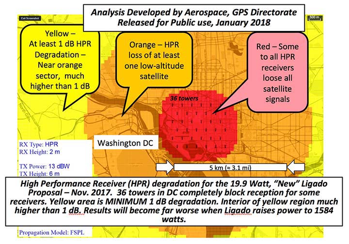
Readers may remember when the original confrontation with LightSquared began in 2011, and the subsequent battle over the frequency ranges adjacent to the GPS bandwidth. The FCC gave LightSquared initial but conditional approval to move forward with terrestrial-based transmission for 4G cellular transmission for up to 40,000 land-based stations. Testing by private and governmental agencies through 2011 and 2012 proved that LightSquared would greatly harm GPS activity for both public and private use. Once exposed, the conditional FCC approval was rescinded and LightSquared retreated into the shadows…until now.
Reformed as Ligado, it has fresh investors and is making a charge into 5G technology with a revised game plan. While it is also looking to use other spectrums for communication, it once again is dangerously close to other current uses. Couple the proximity of adjacent bandwidth with the intense land-based signal versus a very weak satellite signal, there will be significant overriding by the new user. All of this is still being worked out through the FCC and the Department of Defense, so final resolution is yet to be seen.
IMAGES Act
The National Flood Insurance Program (NFIP), as part of FEMA, is looking to move forward with legislation introduced as Improvement of Mapping, Addresses, Geography, Elevations and Structures (IMAGES) Act (H.R 4905). This act intends to reform the NFIP program by utilizing new elevation data collected through the 3DEP program, which will be combined with other parcel attributes including addresses and structure types. This data will then be combined with refined floodway information to identify parcels that are more susceptible to damage caused by storms and flooding.
New legislation can be a good thing, but only if funding can be provided. This bill could provide a major upgrade to the flood mapping and insurance program, but it will hit a big snag with lack of monetary support. The proposed funding for FY2019 is $100 million, yet the project costs for the FY2018 budget is $178 million. This significant difference will make a large impact on the effectiveness of the program and proposed revamp.
Railroad reauthorization
NSPS has spent several years working with various legislators trying to find the right bill to insert language to require railroads to monument their routes before removing tracks. But with the recent accidents of various rail lines, the spotlight has been put on various factors that cause the incidents and how to eliminate their occurrence.
Positive train control (PTC) systems incorporate geospatial data collected through GNSS, lidar and conventional surveying means to work with operational systems to assess dangerous situations. Surveyors will need to be at the forefront of the necessary data collection so our efforts to continue lobbying for railroad funding will continue.
Net Neutrality Act
A political hot topic the surveyor doesn’t typically think about is net neutrality. Most people think they will be affected by lack of neutrality slowing down their home internet or streaming service, but for surveyors it will be a much bigger deal.
A remarkable number of surveyors and mappers use cellular data streaming to provide a connection to a positional correction service. The throttling of this data will effectively slow down the performance and quality of the positional data, leading to less reliability and productivity. It will also slow down the data interaction of office and field staff exchanging data and image files critical to project productivity and success.
So, when the call goes out to contact your federal representative to protect net neutrality, remember how it will affect your surveying business model and make that call.
How professional land surveying associations get it done
Many thanks to the countless hours put in by the NSPS Joint Government Affairs team, consisting of Committee Chair Pat Smith, NSPS Government Consultant John Palatiello, NSPS Federal Lobbyist John “JB” Byrd and NSPS Executive Director Curt Sumner. This group is constantly monitoring legislative action across the country as well as in D.C. and is quick to respond when action is needed on legislative issues. They do a tremendous job, yet not many see them in action. Hopefully all surveyors will continue to see and feel the benefits of their results.
As simple as the process is, the political world has gotten much more complicated as time marches on. From local municipal offices to Washington, D.C., getting things done through legislation has become a long process that takes patience and plenty of money to get your voice heard. Surveyors are no different than any other profession in that we must stay out in front of issues that affect our physical and business world. The important part is to stay informed and have a voice.
Let’s also remember those three fine individuals, memorialized on Mount Rushmore, who accomplished great things after their stints as surveyors, so anything is possible if we keep our voice in government.
Surveying has evolved into a highly technical professional with GNSS as a backbone method of data collection. With the U.S. government at the center of that technology, we need to make sure we, as the surveying practitioner, stays engaged.
lava inundation zones: In this USGS map, colors depict 3 of 18 lava Inundation zones for Mauna Loa. Yellow indicates the volcano’s Northeast Rift Zone, an area along which lava could erupt. The extent of the 1984 eruption and lava flow is superimposed on the map (red).
New U.S. Geological Survey (USGS) maps show areas that could be affected by Mauna Loa lava flows — information critical for response planning. Each zone identifies a segment of the volcano that could erupt lava and send flows downslope.
The volcano has erupted 33 times since 1843. Typically, eruptions began in the summit caldera, with a curtain of fire (a 1- to 2-kilometer line of lava fountains).
Using detailed geologic mapping and modeling of how a fluid (in this case, lava) responds to surface topography, the USGS Hawaiian Volcano Observatory constructed nine maps depicting 18 inundation zones on Mauna Loa, Island of Hawai’i.
Colored regions on these maps show areas on the volcano’s flank that could potentially be covered by flows from future Mauna Loa eruptions. These eruptions could originate from the volcano’s summit, rift zones or radial vents. It’s likely, however, that only part of a zone would be covered in a single eruption.
When a Mauna Loa eruption starts, the maps can help decision makers quickly identify communities, infrastructure and roads between possible vent locations and the coast, facilitating more efficient and effective allocation of response resources, the USGS said. The public can also use the maps to consider where lava flows might go once an eruption starts.
lava flow glow: Had the Mauna Loa inundation maps been available in April 1984, when the volcano last erupted, the maps could have been used to determine that the northern portion of Hilo was the most likely area to be impacted by the main lava flow. (Photo: David Little)
Lava inundation zones: In this USGS map, colors depict 3 of 18 lava Inundation zones for Mauna Loa. Yellow indicates the volcano’s Northeast Rift Zone, an area along which lava could erupt. The extent of the 1984 eruption and lava flow is superimposed on the map (red). (Map: USGS)
New U.S. Geological Survey (USGS) maps show areas that could be affected by Mauna Loa lava flows — information critical for response planning. Each zone identifies a segment of the volcano that could erupt lava and send flows downslope.
The volcano has erupted 33 times since 1843. Typically, eruptions began in the summit caldera, with a curtain of fire (a 1- to 2-kilometer line of lava fountains).
Using detailed geologic mapping and modeling of how a fluid (in this case, lava) responds to surface topography, the USGS Hawaiian Volcano Observatory constructed nine maps depicting 18 inundation zones on Mauna Loa, Hawaii.
Colored regions on these maps show areas on the volcano’s flank that could potentially be covered by flows from future Mauna Loa eruptions. These eruptions could originate from the volcano’s summit, rift zones or radial vents. It’s likely, however, that only part of a zone would be covered in a single eruption.
When a Mauna Loa eruption starts, the maps can help decision makers quickly identify communities, infrastructure and roads between possible vent locations and the coast, facilitating more efficient and effective allocation of response resources, the USGS said. The public can also use the maps to consider where lava flows might go once an eruption starts.
lava flow glow: Had the Mauna Loa inundation maps been available in April 1984, when the volcano last erupted, the maps could have been used to determine that the northern portion of Hilo was the most likely area to be impacted by the main lava flow. (Photo: David Little)
MODIS Image of Hurricane Harvey. This natural color image of Hurricane Harvey was acquired by the Moderate Resolution Imaging Spectroradiometer on NASA’s Terra satellite as the hurricane reached the Gulf Coast of Texas at 12:25 p.m. local time on Aug. 25, 2017. (Image: USGS)
Free and rapid imagery was provided through the USGS Hazard Data Distribution System.
The calls for assistance started days before Hurricane Harvey came barreling across America’s doorstep this summer. First responders and government officials needed answers to prepare and protect communities.
How strong is this storm going to be? What kind of damage occurred on its path through the Caribbean? How might it impact southeast Texas once it makes landfall?
Remotely sensed imagery was provided — at no cost and almost daily — through the U.S. Geological Survey’s (USGS) Hazard Data Distribution System (HDDS) for analysis on the extent, severity and evolution of hurricanes Harvey, Irma and Maria.
“USGS staff worked around the clock to keep HDDS populated with satellite and aerial imagery,” said Brenda Jones, who is the disaster response coordinator for the USGS Earth Resources Observation and Science Center (EROS).
15,000 images were downloaded from HDDS following the three storms. Requests came from 48 government agencies, including the U.S. Senate, Foreign Agricultural Service, Department of Homeland Security and the Centers for Disease Control and Prevention.
For example, Harvey dropped as much as 52 inches of rain in Houston. The Federal Emergency Management Agency used data from HDDS to identify roads and other infrastructure that were under water in an effort to better direct rescue efforts.
“Quick, easy and centralized access to high-quality imagery made it possible to create maps that were useful to disaster management authorities,” Jones said. “We haven’t had a hurricane season like this for a very long time, and the HDDS system proved invaluable to rescue efforts.”
In addition to hurricanes, HDDS is useful for numerous hazard situations. For example, following the recent earthquake near Mexico City, imagery provided through HDDS allowed first responders to see collapsed buildings, blocked roads and damaged infrastructure.
During fire season, HDDS makes it possible for first responders to have wide-scale pictures of situations.
HDDS acquires imagery and data from several sources, including the International Charter for Space and Major Disasters, of which the USGS is a member. Once the hurricane season began, USGS EROS staff began pulling data acquired by space and aerial systems and loading them into HDDS.
GEOS-13 Image of Hurricane Maria and Tropical Storm Jose. Image of Hurricane Maria and Tropical Storm Jose acquired by the Geostationary Operational Environmental Satellite 13 at 1:15 p.m. local time on Sept. 19, 2017. The satellite is operated by NOAA while NASA helps develop and launch the GOES series of satellites. (Image: USGS)
A new tool that gives users a detailed view of the world’s mountains is now available from the U.S. Geological Survey (USGS).
The Global Mountain Explorer can help users ranging from hikers to scientists, resource managers and policy makers seeking information on these prominent yet often understudied landscapes.
Mountains occupy from 12 to 31 percent of the land surface of the Earth, but despite their importance, few attempts have been made to scientifically define and map these regions worldwide with detail, the USGS said.
The Global Mountain Explorer “allows anyone with access to the Internet to explore where mountains are, whether they are low or high, scattered or continuous, snowy or snow-free,” said USGS ecosystems geographer Roger Sayre, who led the project.
Mountain Explorer provides information from global scales down to specific mountains, such as Borah Peak, Idaho, pictured here. (Public domain)
“Mountain Explorer users can visualize and compare in one place and for the first time the three major global mountain maps that have been produced,” he said.
Mountains provide significant water, timber and mineral resources, and food, fiber and fuel products. They are home to diverse ecosystems and wildlife and are valued for their esthetic beauty and recreational offerings.
Mountain areas are also prone to natural hazards. But despite their importance, surprisingly few attempts have been made to scientifically define and map these regions worldwide with detail.
The USGS developed the Global Mountain Explorer, in partnership with Esri, and three organizations at the University of Bern in Switzerland — the Center for Development and Environment, the Global Mountain Biodiversity Assessment and the Mountain Research Initiative.
Twilight image of snow-covered Mount Shasta with city lights visible at its base. The Global Mountain Explorer allows users to view mountains and surrounding terrain. (Public domain)
The tool was developed as part of a Group on Earth Observations initiative to accurately delineate mountain regions using best available data. It is intended to provide information on the global distribution and a variety of mountain data with a resolution 16 times more detailed than previous mapping efforts.
Users can select an area by zooming in or by typing a place name like Mt. Kilimanjaro to view its elevation and type. They can also select from a number of backdrops — satellite images, topographic maps or political boundary maps— on which to display the different types of mountain classes. A tutorial showing the full features for the Global Map Explorer is shown below.
Using live data from USGS and Waze, a new Esri interactive map visualizes active wildfire locations and traffic alerts for Northern California.
The map incorporates a new mapping technique to group traffic alerts at locations where there is a high density of alerts. This method enables faster and more effective visual analysis in areas where there are many alerts that would normally overlap.
Active fire data displays the locations of large fire incidents in Northern California. Data is provided by the U.S. Department of Agriculture Forest Service and The Geospatial Multi-Agency Coordination Group, and is intended to give near real-time understanding of the situation on the ground.
Location and status of active fires is updated throughout the day as new information is gathered by first responders.
Data from Waze is reported by users of Waze and updated every two minutes. This data, provided by Waze through the Connected Citizens Program, contains filtered data for affected area including system-generated traffic jams and user-reported traffic incidents (including jams, accidents, hazards, construction, potholes, roadkill, stopped vehicles, objects on road, and missing signs).
DigitalGlobe releases images of Northern California wildfires
DigitalGlobe has released high-resolution satellite images of the wildfires burning in Northern California. These wildfires have killed at least 21 people, destroyed at least 3,500 structures, and burned more than 115,000 acres.
The Oct. 10 images were collected using the Shortwave Infrared (SWIR) sensor on DigitalGlobe’s WorldView-3 satellite, which is uniquely able to pierce through the wildfire smoke to see where the fires are burning on the ground. For comparison, the ground and the fire line are completely obstructed by smoke in the natural color image of the same area (see the larger overview image on the first slide).
The Oct. 11 images were taken by DigitalGlobe’s GeoEye-1 satellite. Some of these are natural color, while others are shown in the Very Near Infrared (VNIR), where burned areas appear gray and black and healthy vegetation is red.
Additionally, DigitalGlobe has activated its Open Data Program, which provides imagery to support recovery efforts in the wake of large-scale natural disasters. Pre- and post-wildfire imagery of the affected areas are available to emergency responders on the Santa Rosa wildfires page.