The National States Geographic Information Council (NSGIC) has released a joint statement on the value of GIS during the COVID-19 pandemic, alongside its partners the MidAmerica GIS Consortium (MAGIC), Open Geospatial Consortium (OGC), Urban and Regional Information Systems Association (URISA), and American Association of Geographers (AAG).
Joint Statement on the Value of GIS in the Pandemic
The spread and effects of COVID-19 can be best understood considering space and time.
As governments are responding to COVID-19, more leaders are recognizing the value of “knowing the where.” The importance of knowing where the outbreak is growing, where high risk populations are, where the hospital beds and important medical resources are, and where to deploy resources is essential. “Knowing the where” informs better decision-making.
In an effort to better understand the where, governments are recognizing the value of geospatial information and technologies and are engaging geospatial professionals to help them better understand the where to help them in their decision-making and response.
Geospatial professionals bring unique analytical and visualization skills to the table that help responders and decision-makers visualize where the pandemic is spreading more quickly and can make the important decisions regarding where response and resource needs need to be focused. The value of telling the story through a map coupled with a geospatial dashboard provides a view of the event not readily seen in a table such as a spreadsheet.
Beyond visualizing existing data, we can connect data from a location perspective, which enhances the value of the data sources being integrated. Equally important in this event is data on COVID-19 cases and testing packaged and shared in a way useful to scientists.
GIS (geographic information systems) is experiencing an unprecedented level of use. Historically, GIS was deployed following a disaster to help respond and recover. Today, GIS is used as a disaster is unfolding. The COVID-19 event is an outstanding example of how effective GIS is when robust data is available. Governments are realizing the value of investing in these systems and the people who run them.
The information necessary to empower all partners already exists.
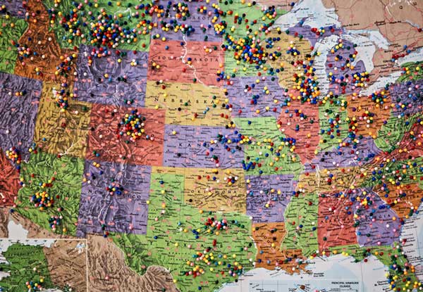
Current nationwide models and response efforts may not benefit from the details of local geographic parameters. Local or statewide models and response efforts may not fully take advantage of the data from other areas of the country. Hospitals are surveyed by both federal and state agencies, and the results of those surveys are not readily available to the hospitals working together to care for patients. Nationwide geospatial data will empower a coalition of participants with a better understanding of the spread and impacts of COVID-19 and improve mitigation actions.
The same data can be made available in different forms to empower people playing different roles in the response. Researchers — epidemiologists — will benefit from nationwide COVID-19 testing data and data describing factors impacting the spread. This data needs to be as disaggregated as permissible under HIPAA and in a form readily digestible in models.
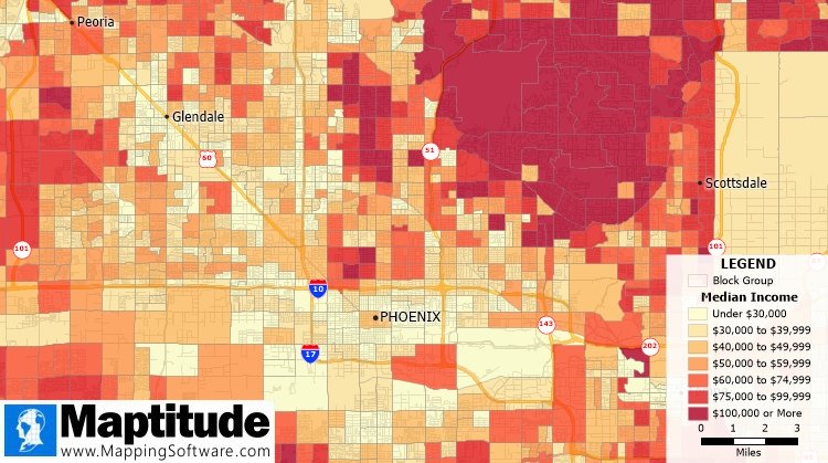
The case data could be aggregated to the same units of geography as a wealth of existing demographic data (Census tracts), which could explain and quantify local variances in the spread. Policy makers and those in emergency management can benefit from map and tabular dashboards, harnessing the power of the where by integrating data for analytics.
The emergency response, public health and geospatial communities must come together to understand COVID-19 in the U.S. and mitigate its spread and overall impact.
By geo-enabling public health and emergency response data, we can better:
- understand the spread — with COVID case data, movements of people, and symptoms
- understand the impact on individuals — with data including age, disease, obesity, and medical treatments
- understand how to tailor outreach — by age, language, engagement with government, and lifestyle choices
- understand the needs of the healthcare industry — by facility, day, bed capacity, type of care, ventilators, and PPE
- understand the impact on the local economy — by county, day, unemployment, and bankruptcies
- understand the societal impacts — by census tract, domestic violence, alcohol consumption, child abuse, animal abuse, elder abuse, mental health crises, 3-1-1 calls and firearm sales
We are committed to beginning the national conversation about leveraging the best available data to better understand the spread and impacts of COVID-19.
To receive more information and be part of the discussion, please share your email address with us.
National States Geographic Information Council (NSGIC)
MidAmerica GIS Consortium (MAGIC)
Open Geospatial Consortium (OGC)
Urban and Regional Information Systems Association (URISA)
American Association of Geographers (AAG)
Feature image: Kat72/iStock / Getty Images Plus/Getty Images